
It's more than just a pretty picture
Branding is more than just how something looks it’s about the story you tell and the emotions people connect with. Through thoughtful brand marketing, strategy, visuals, and content work together to create an identity that feels recognizable, memorable, and meaningful.
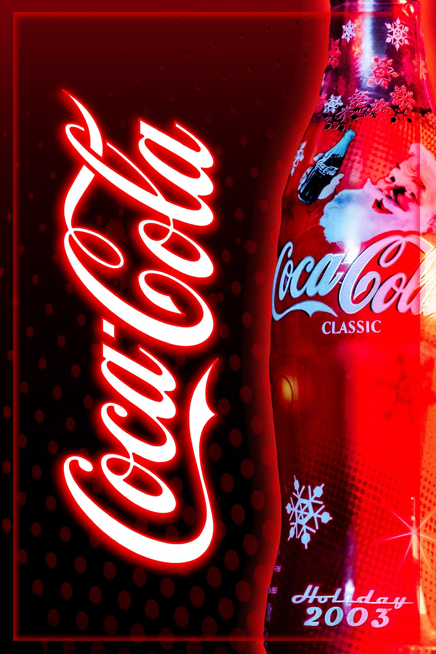
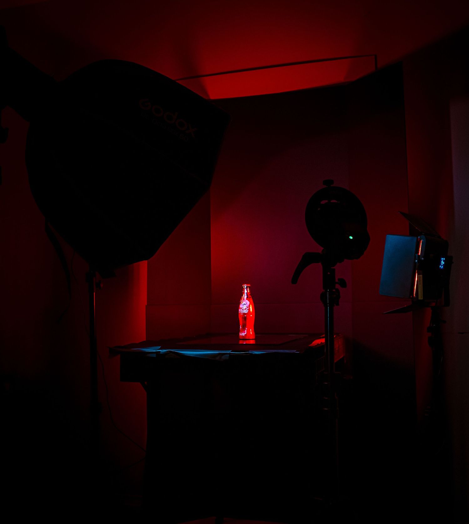
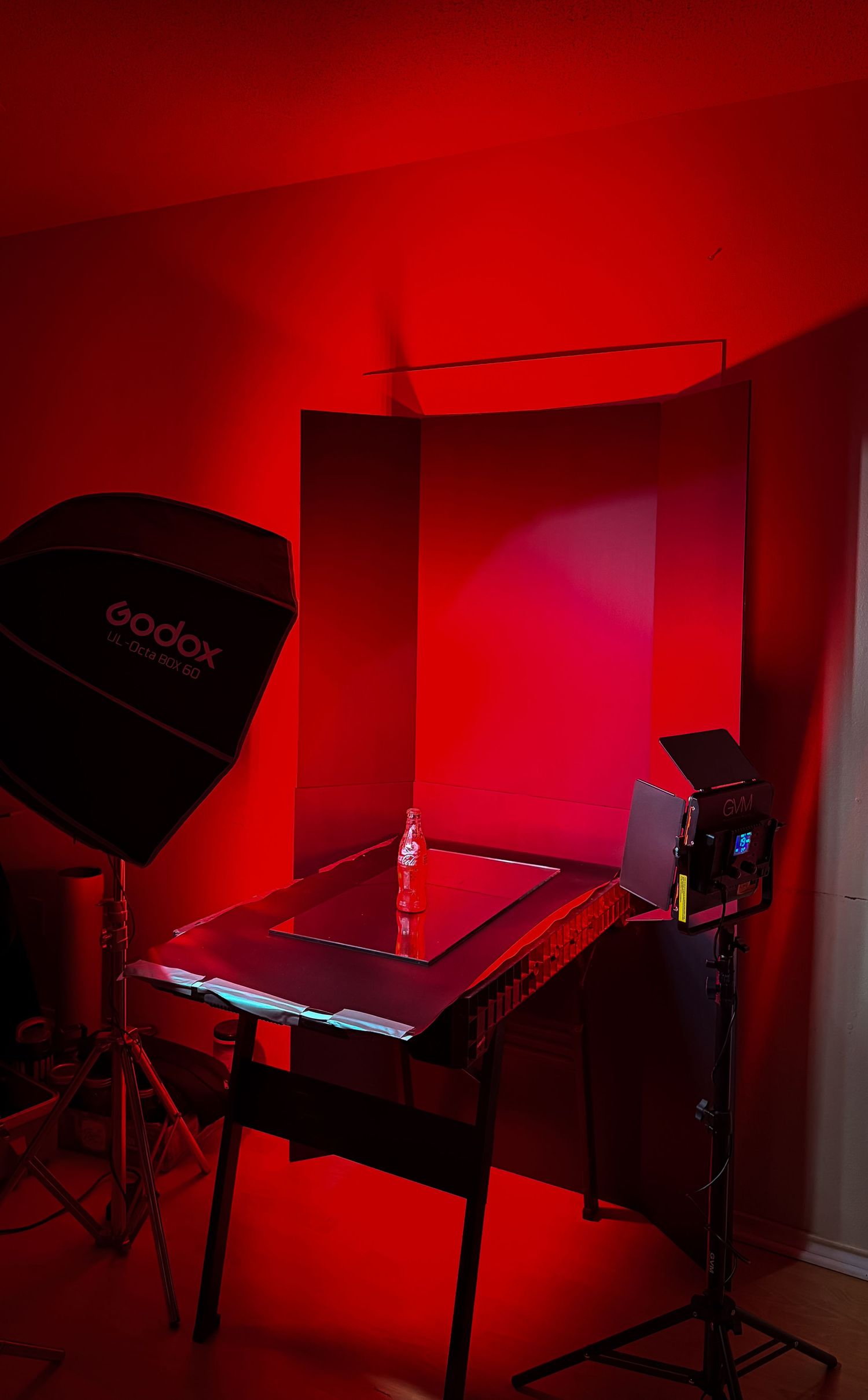
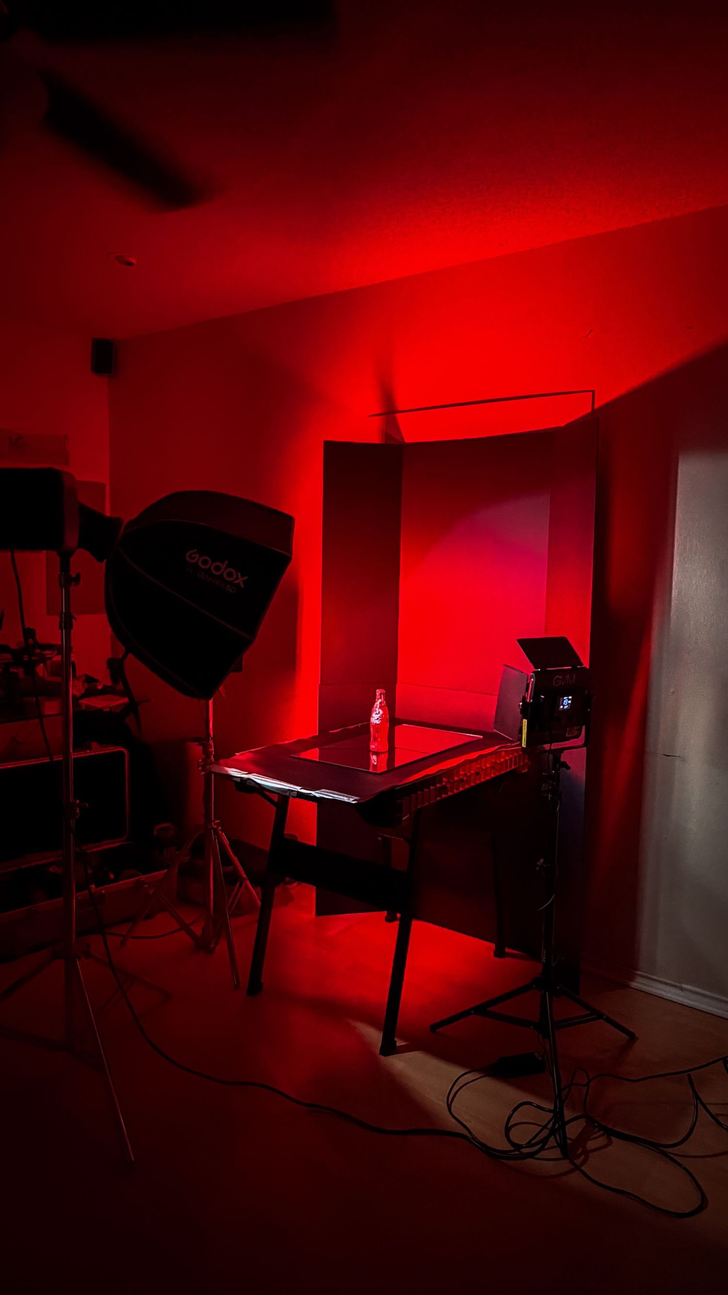
FROM BEING JUST A CLASSIC COLA TO STYLING IT IN A GRAPHIC
This seasonal Coca-Cola concept was built around creating a warm, nostalgic Christmas feeling through both photography and graphic design. I produced a full branded photoshoot around the bottle, then carried the same holiday direction into the final visuals to create a consistent campaign-style look.
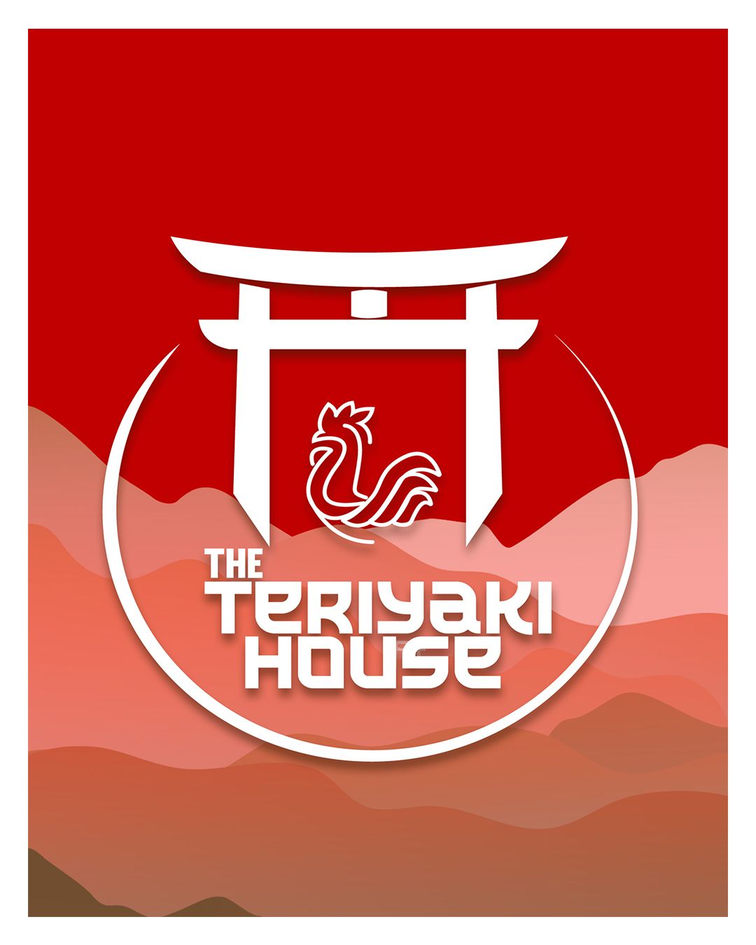
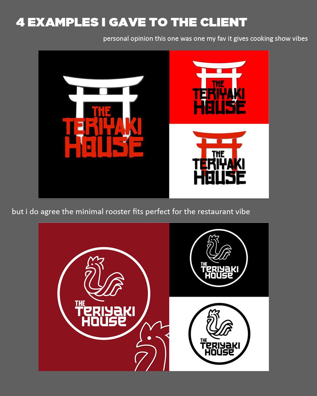
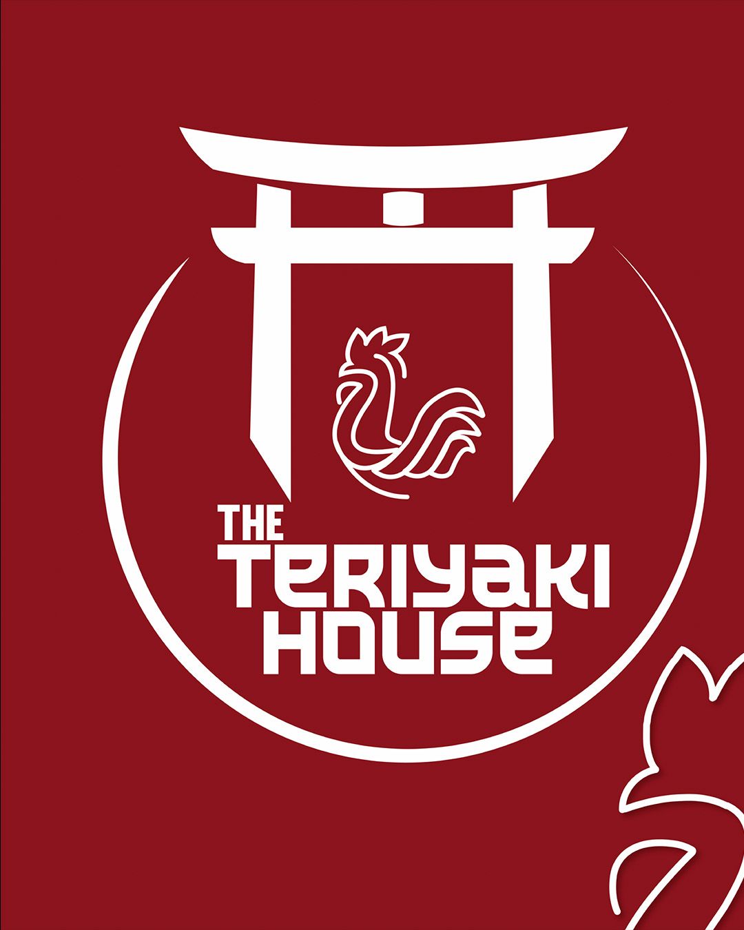
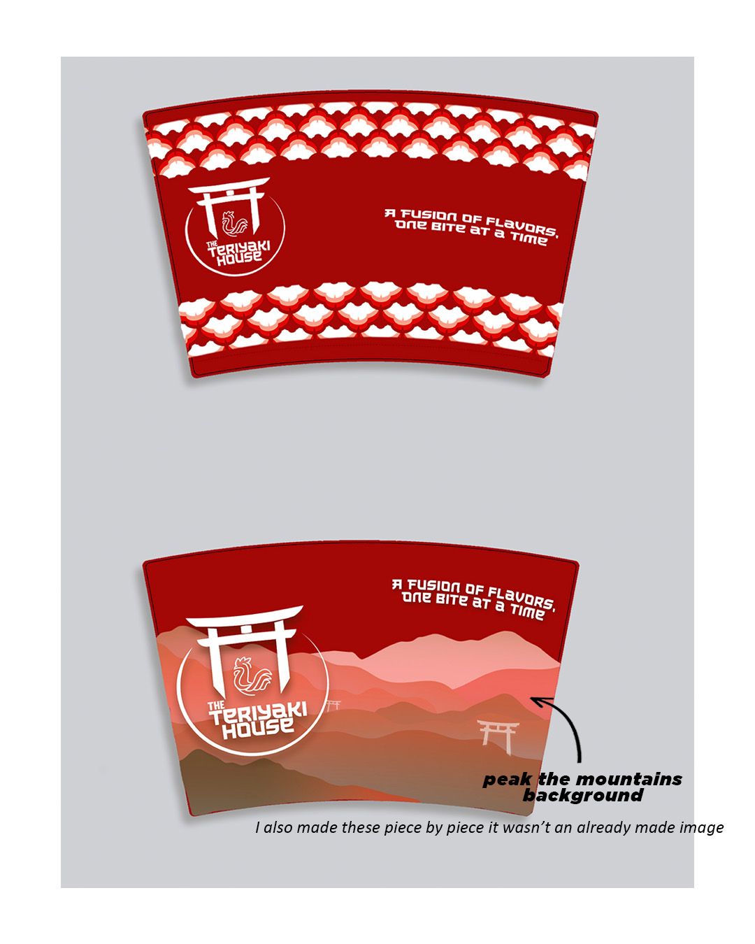
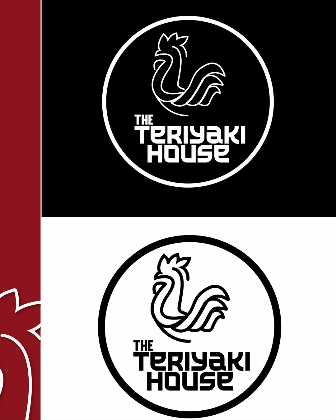
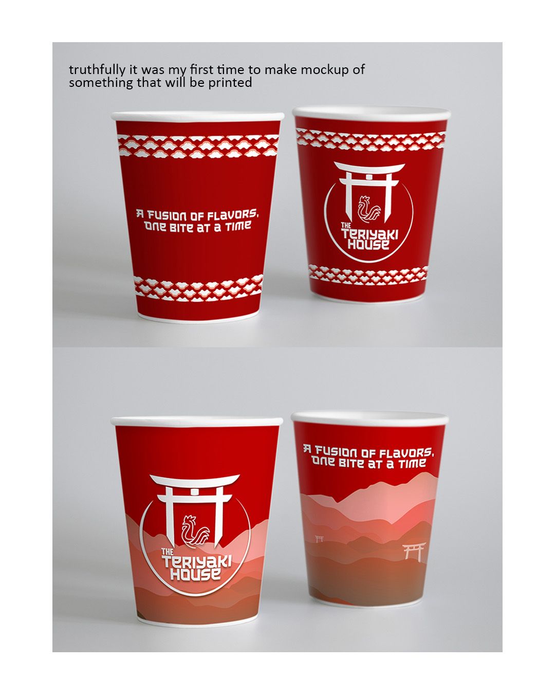
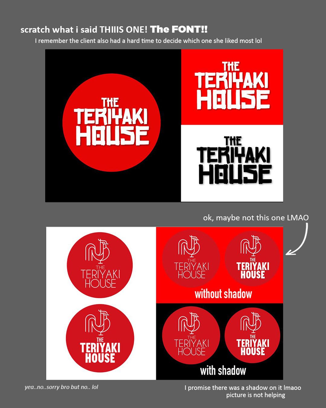
The Teriyaki House, the goal was to create a minimal identity using clean line work. The owners wanted a rooster in the logo while also incorporating Asian inspired elements, so I used a traditional Chinese style arch to frame the design and bring both ideas together in a simple, recognizable way.
THE TERIYAKI HOUSE
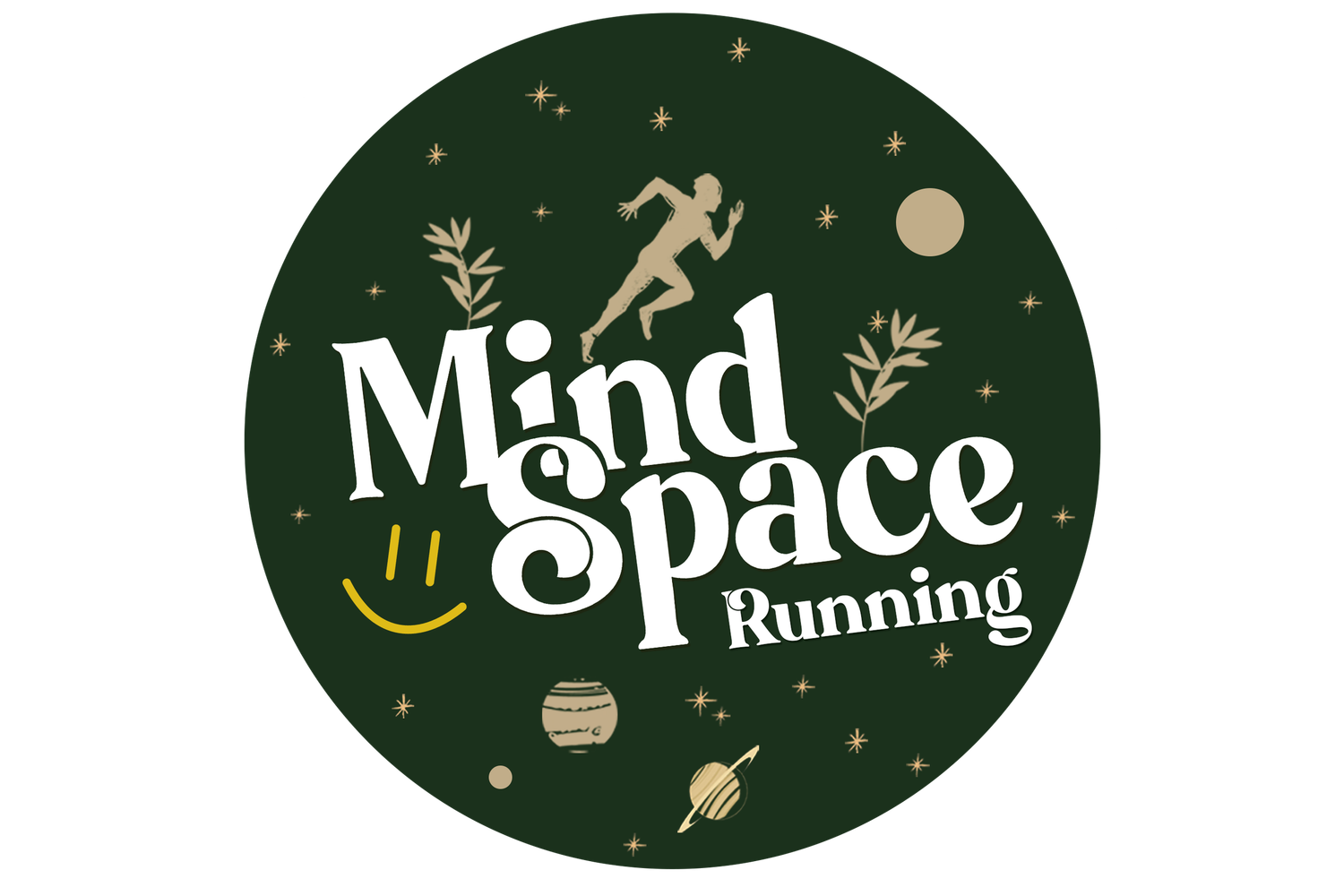
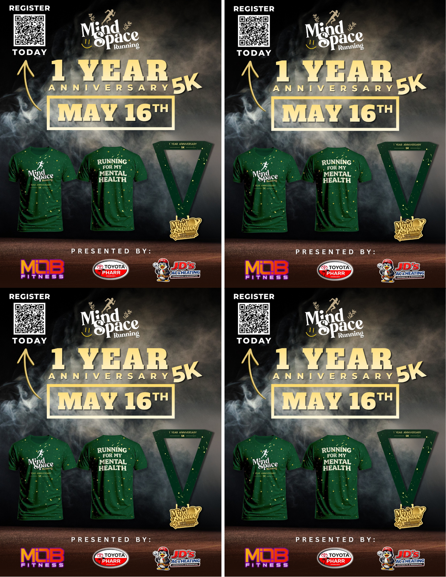
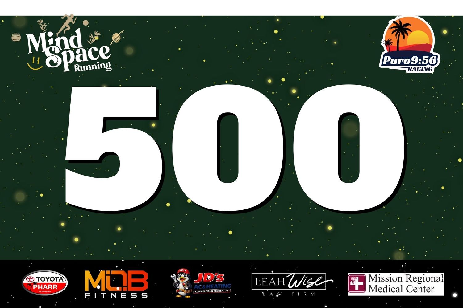
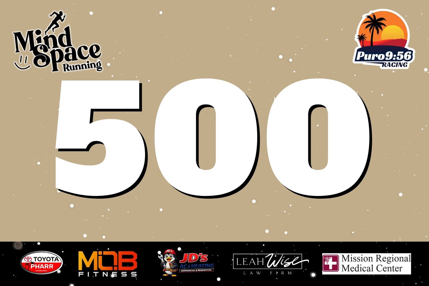
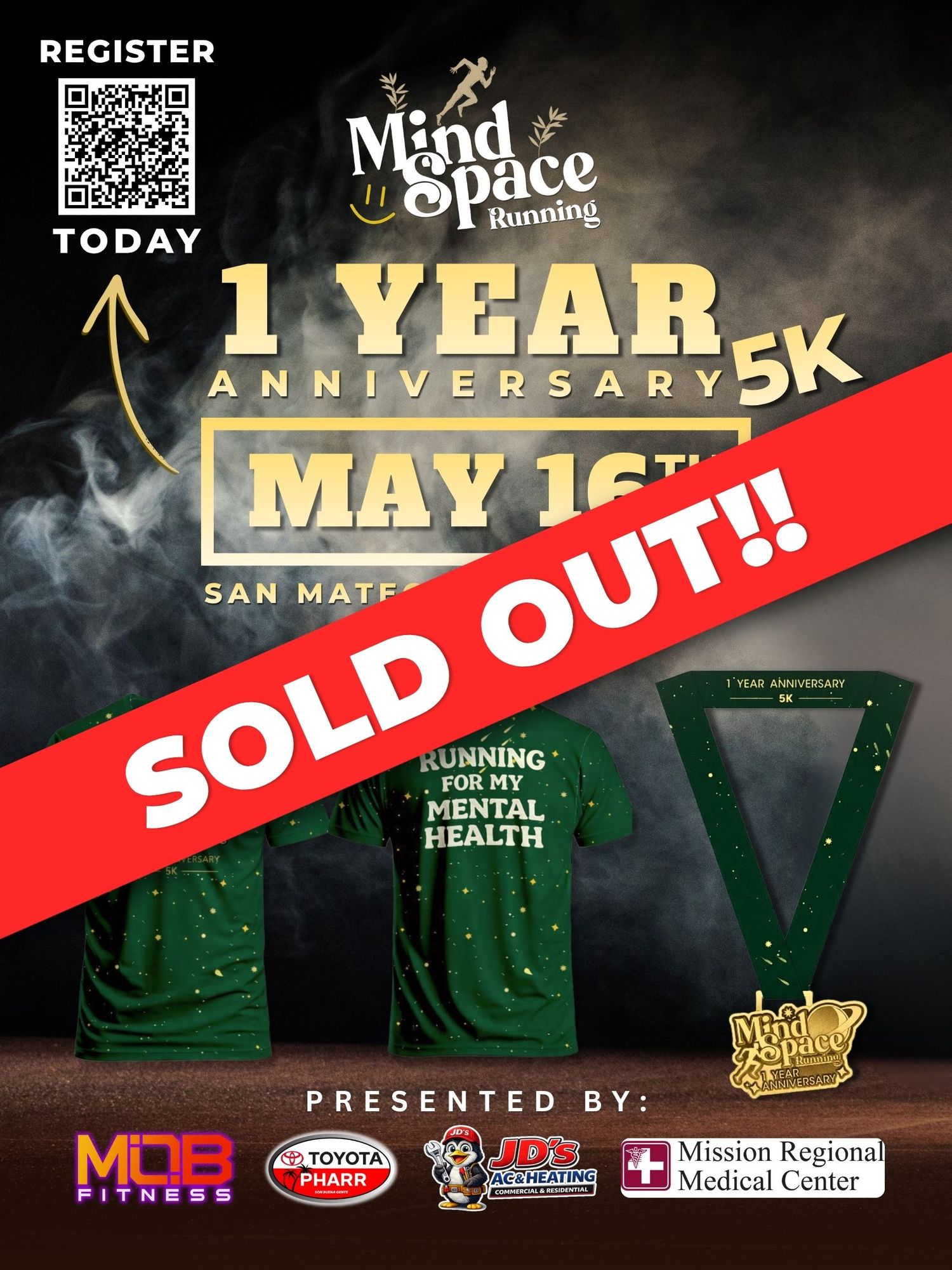
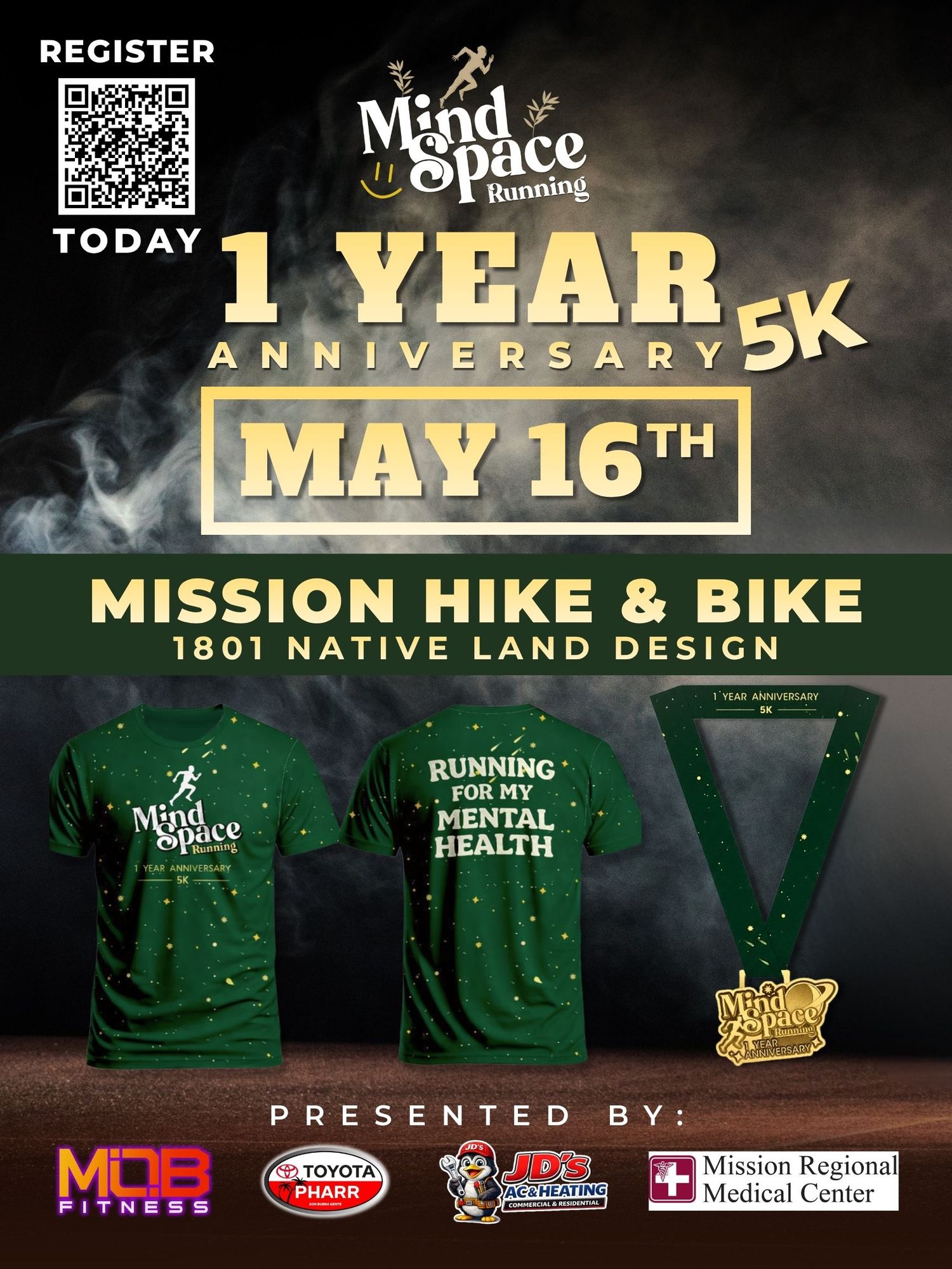
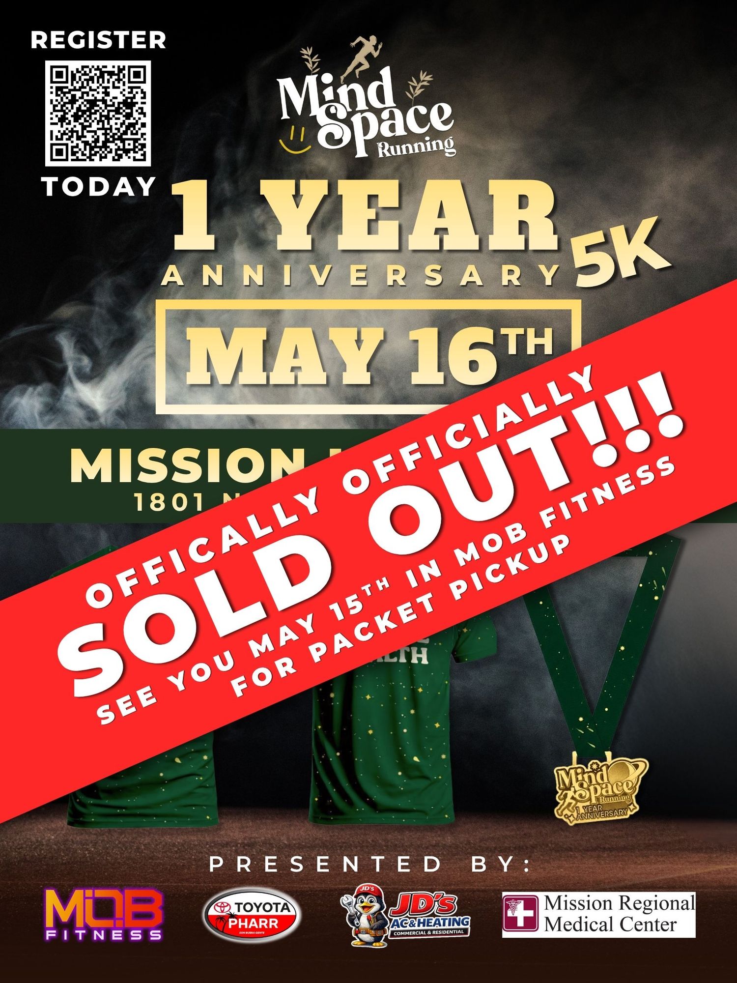
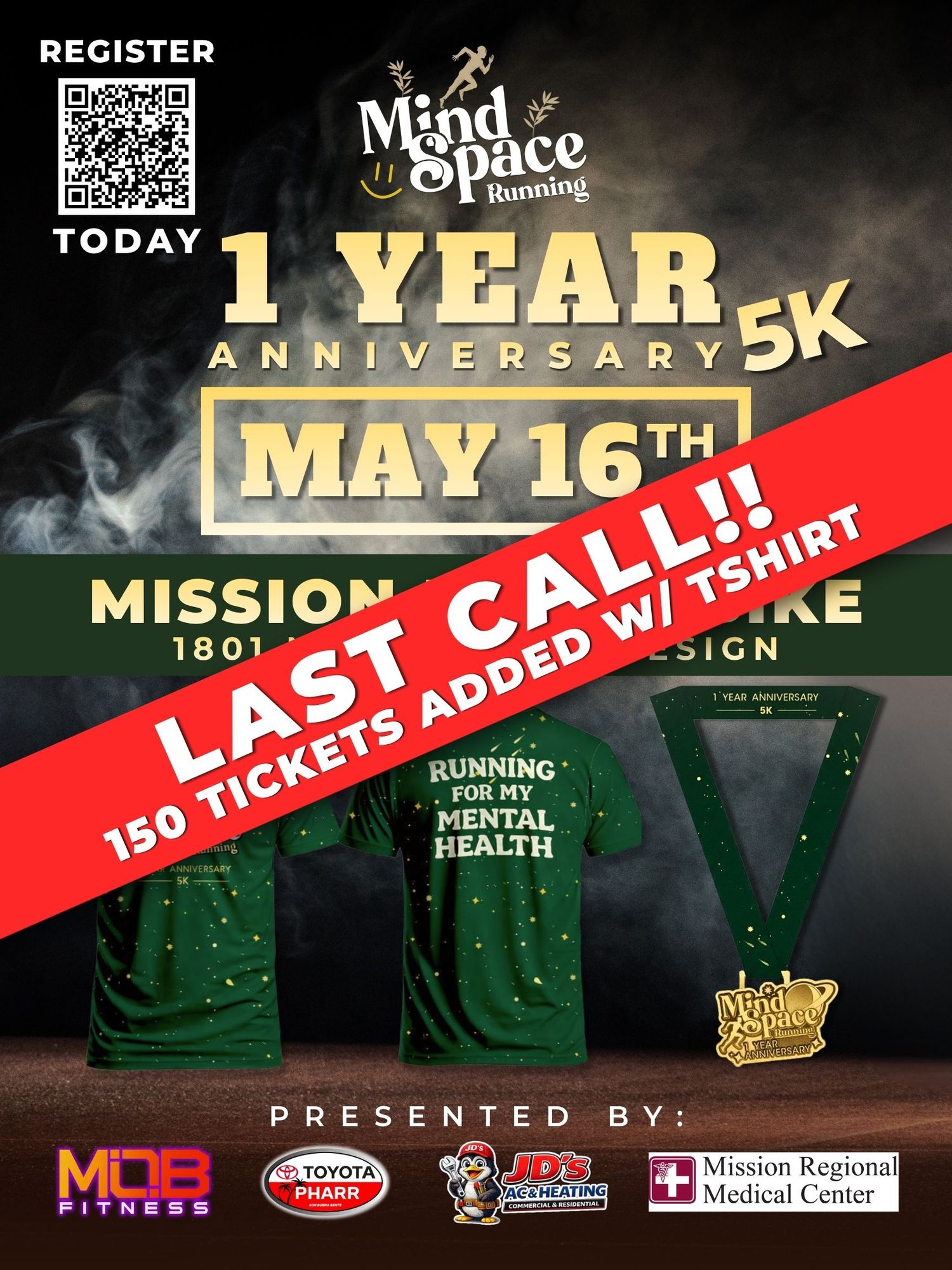
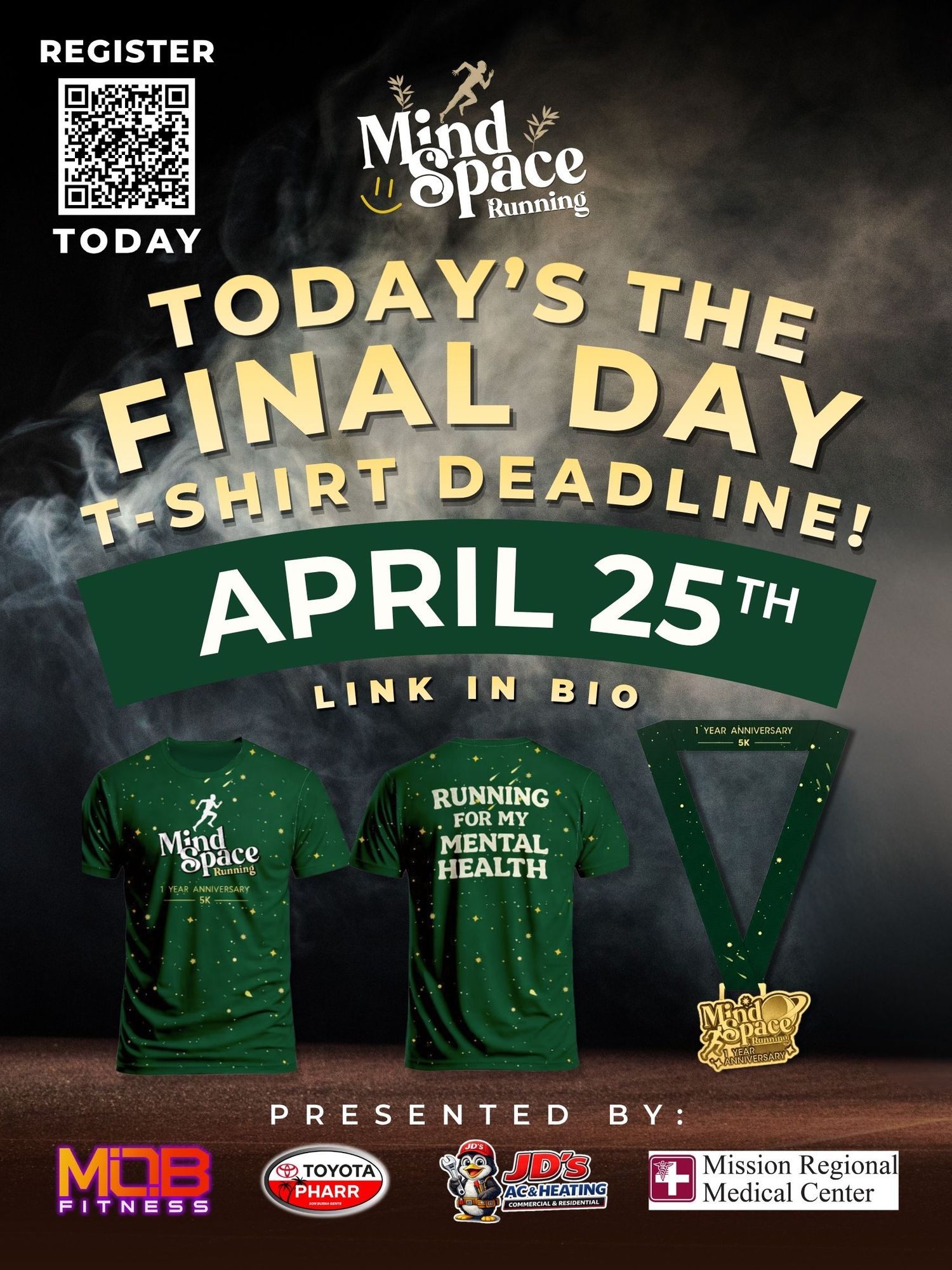
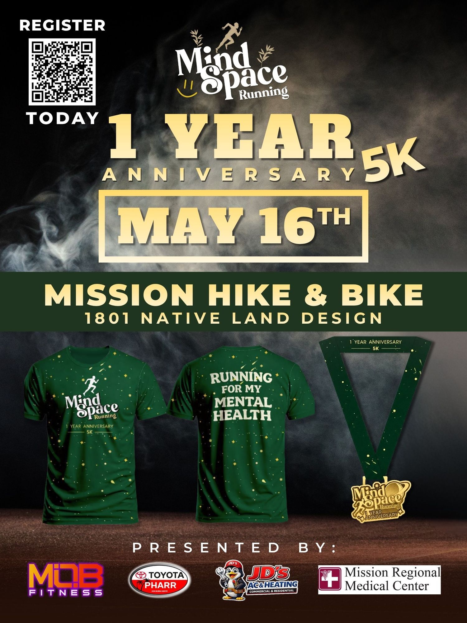
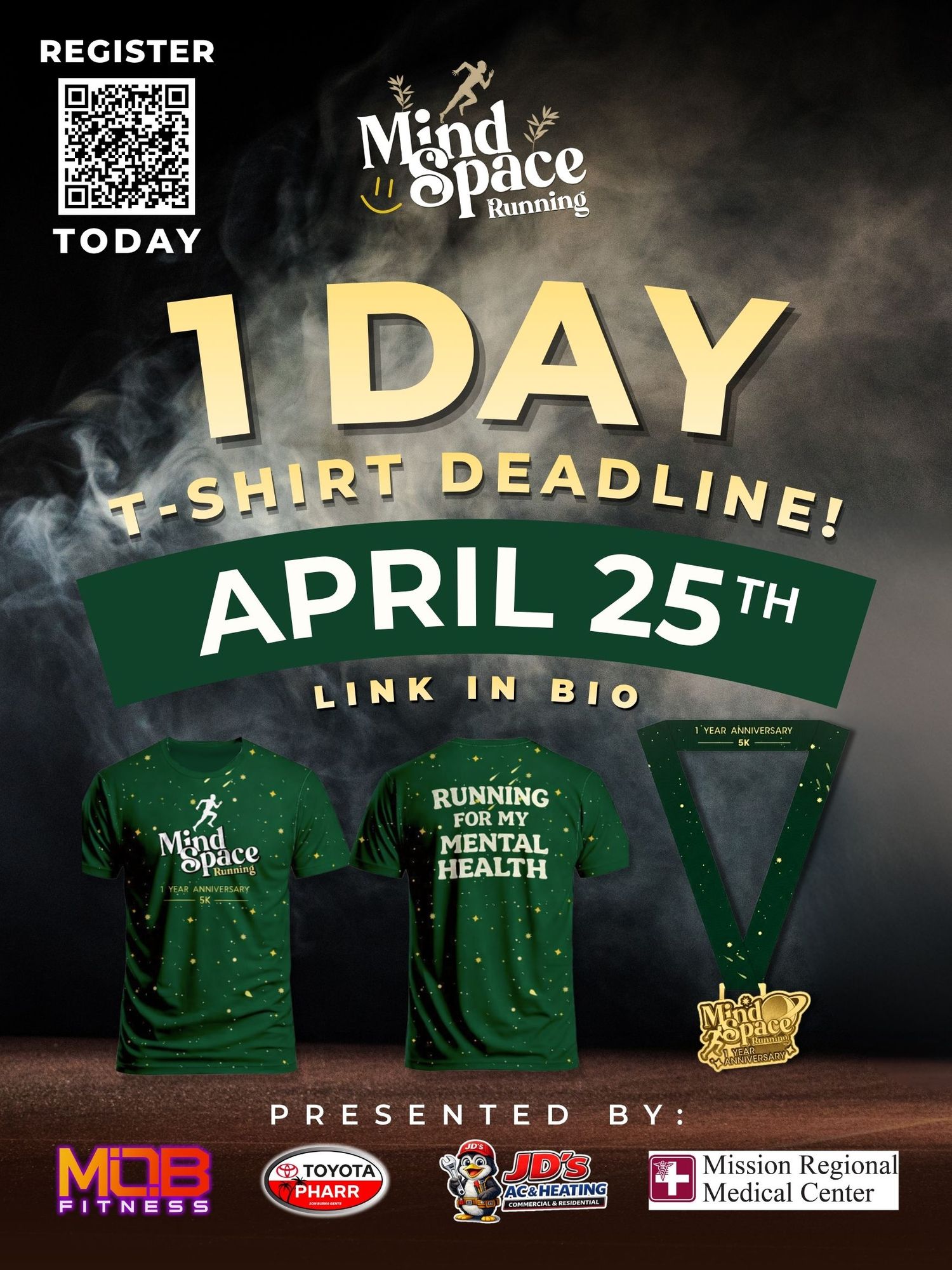
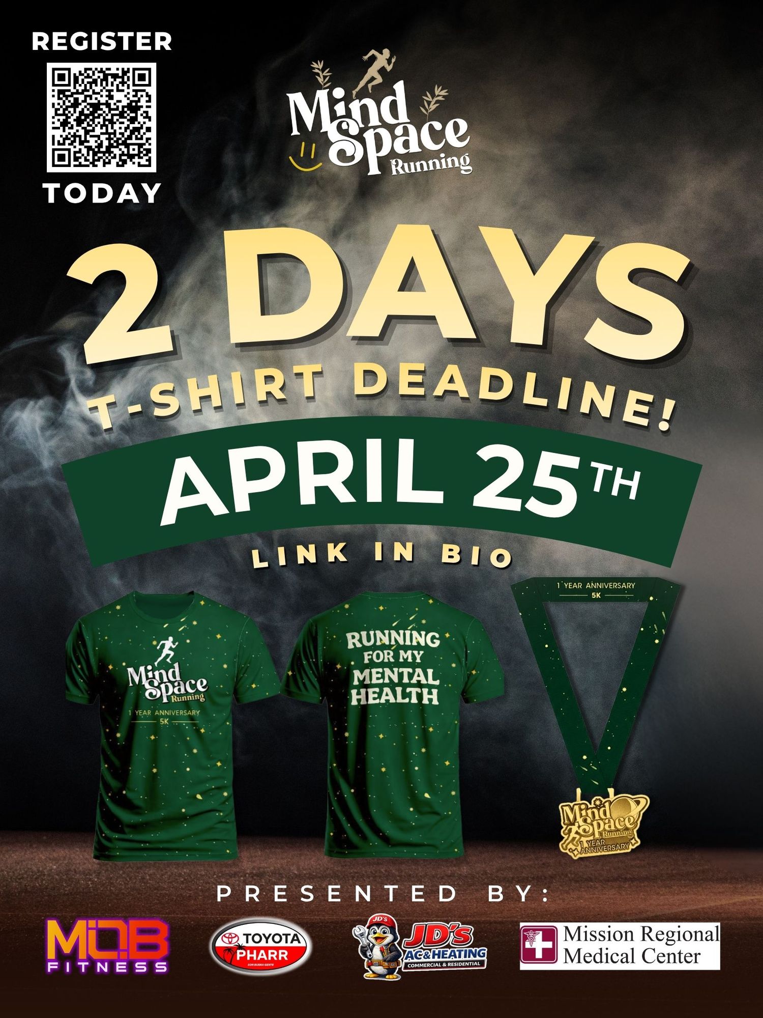
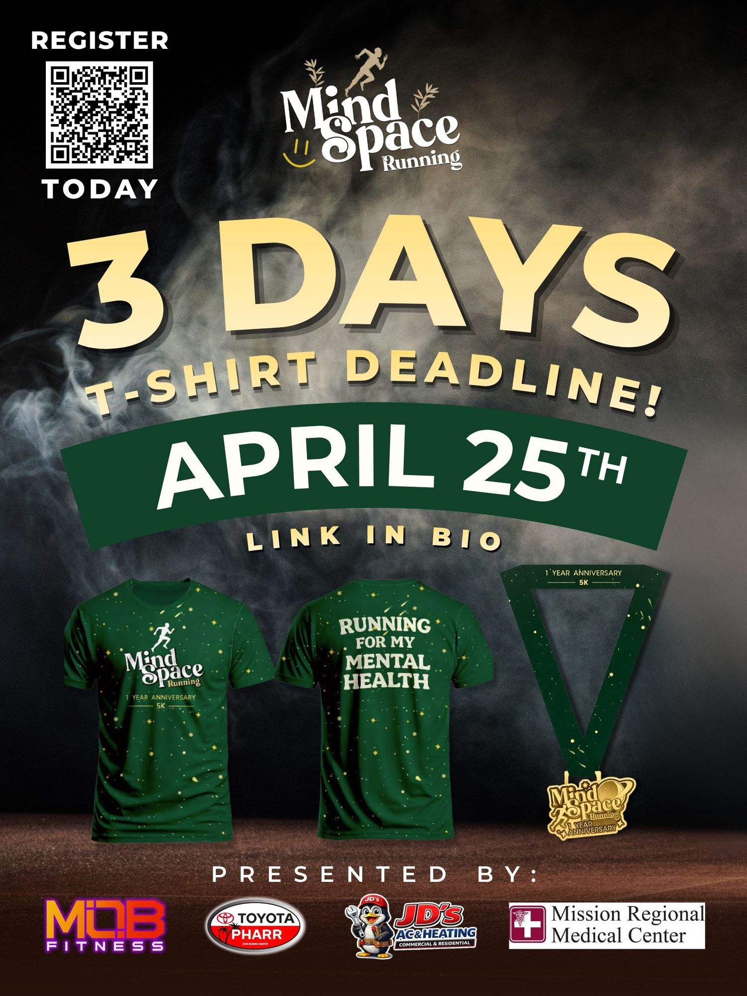
Mind Space Run was a mental health-focused community 5K created to promote awareness, connection, and wellness. I was responsible for the event’s creative direction, branding, logo design, promotional graphics, marketing content, photography and overall visual presentation leading up to and during the event.
The Mind Space running
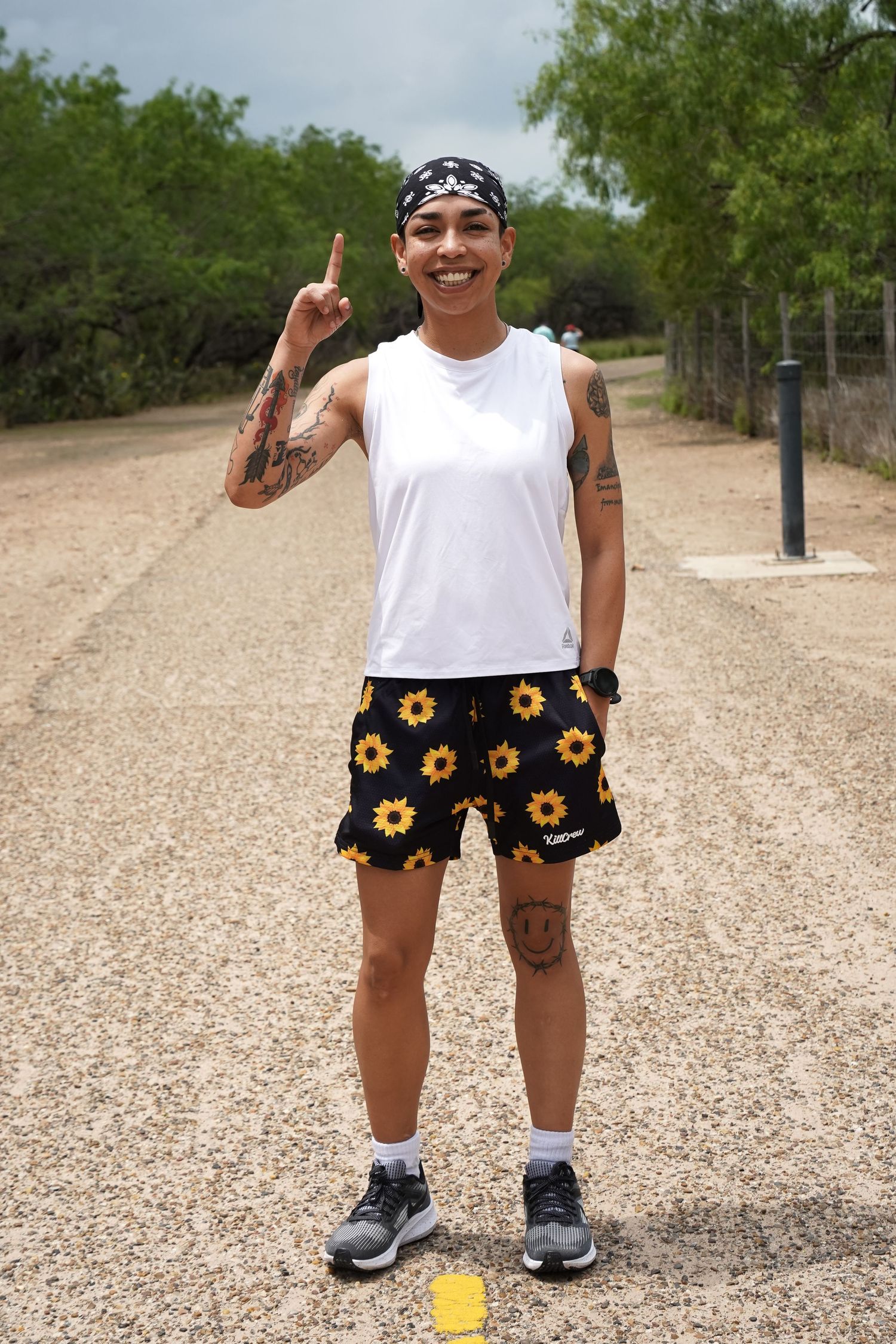
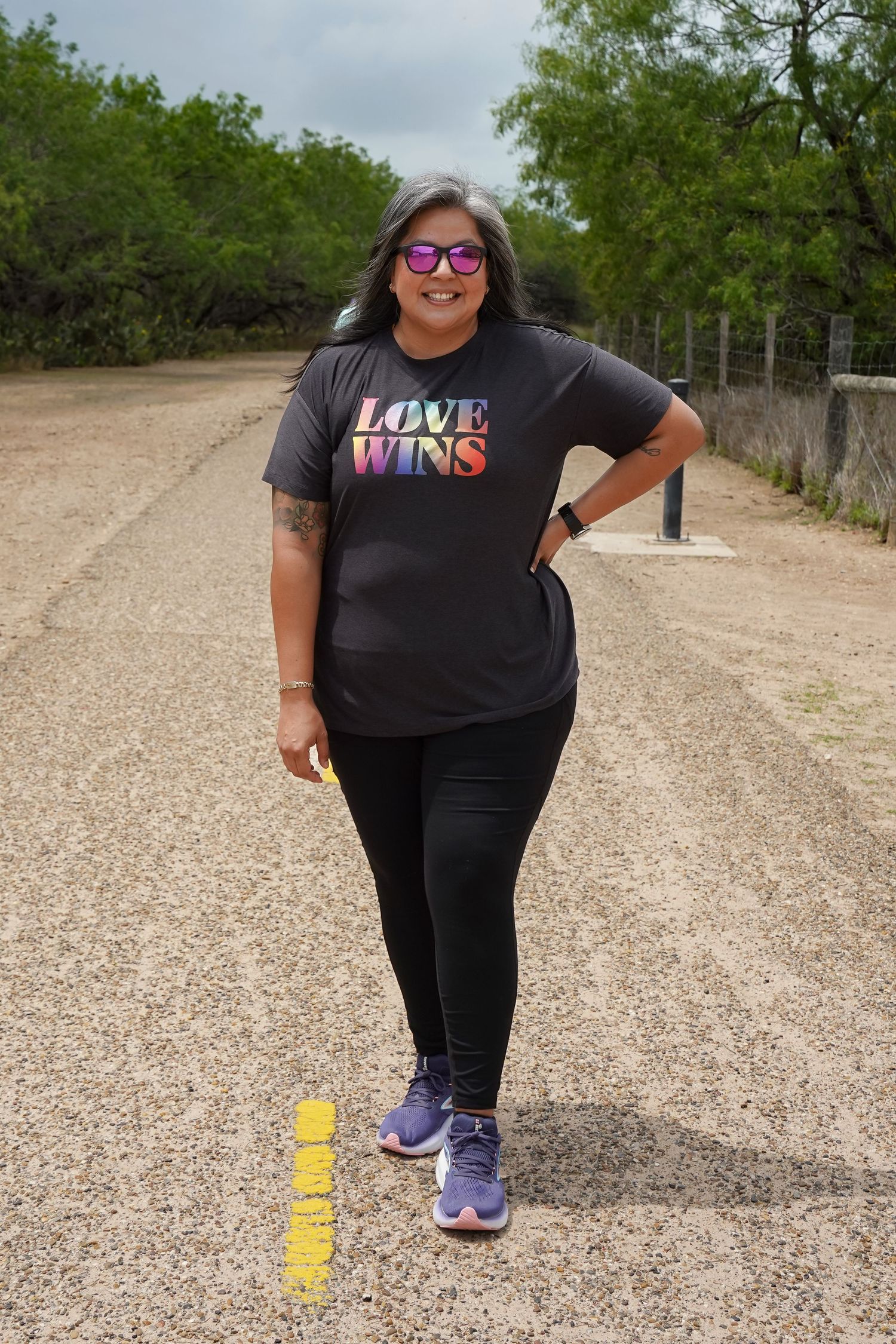
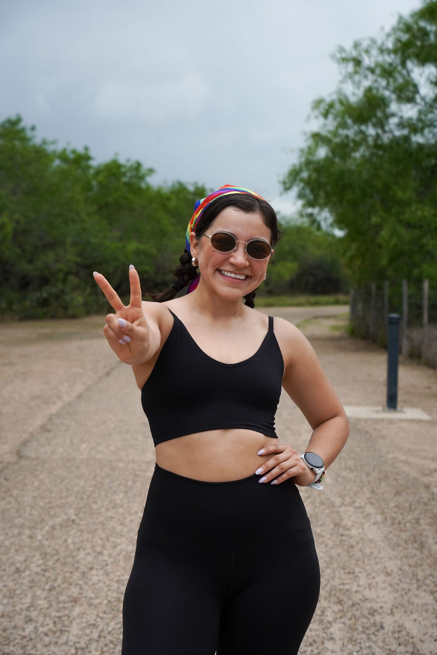
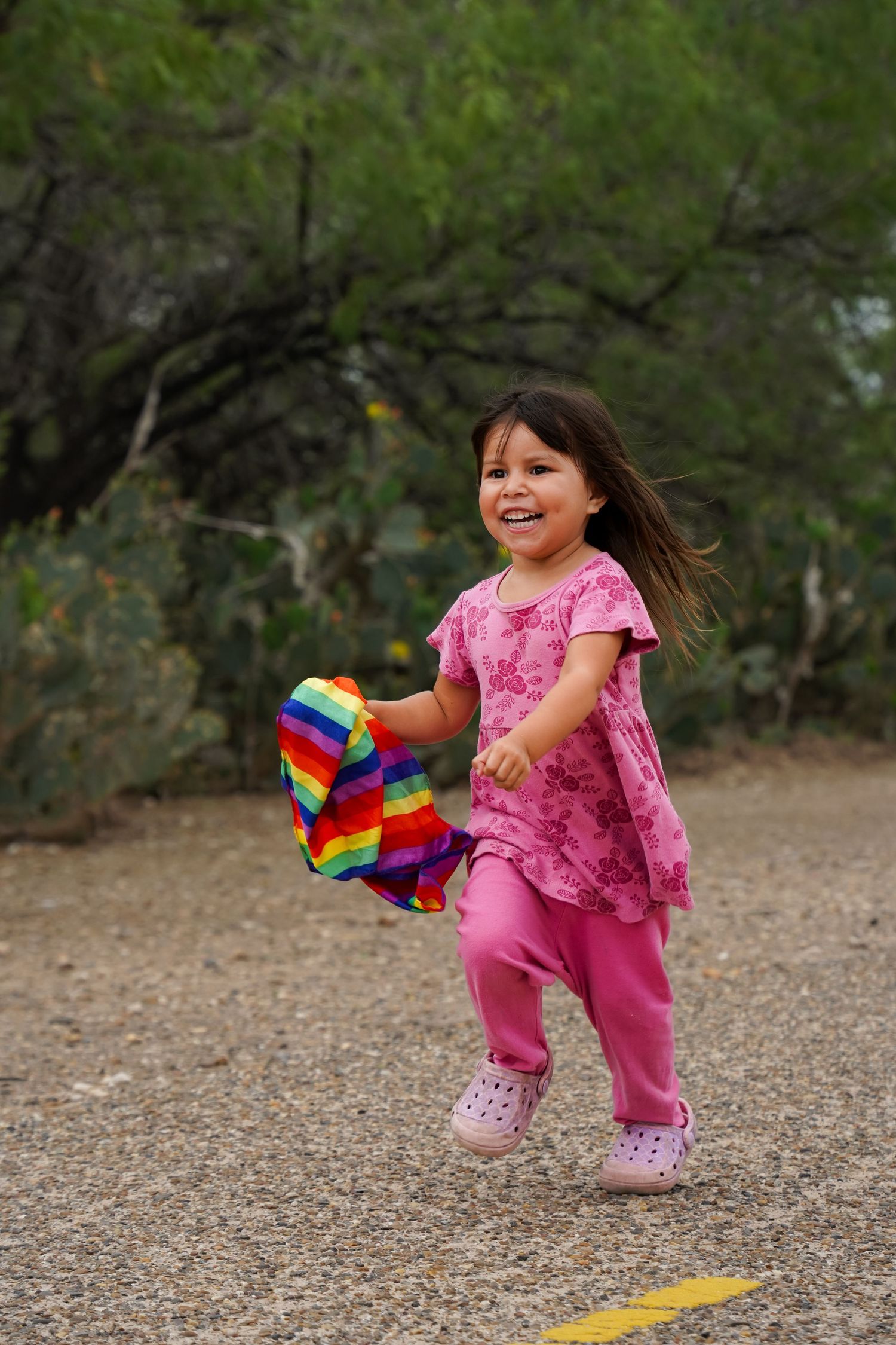
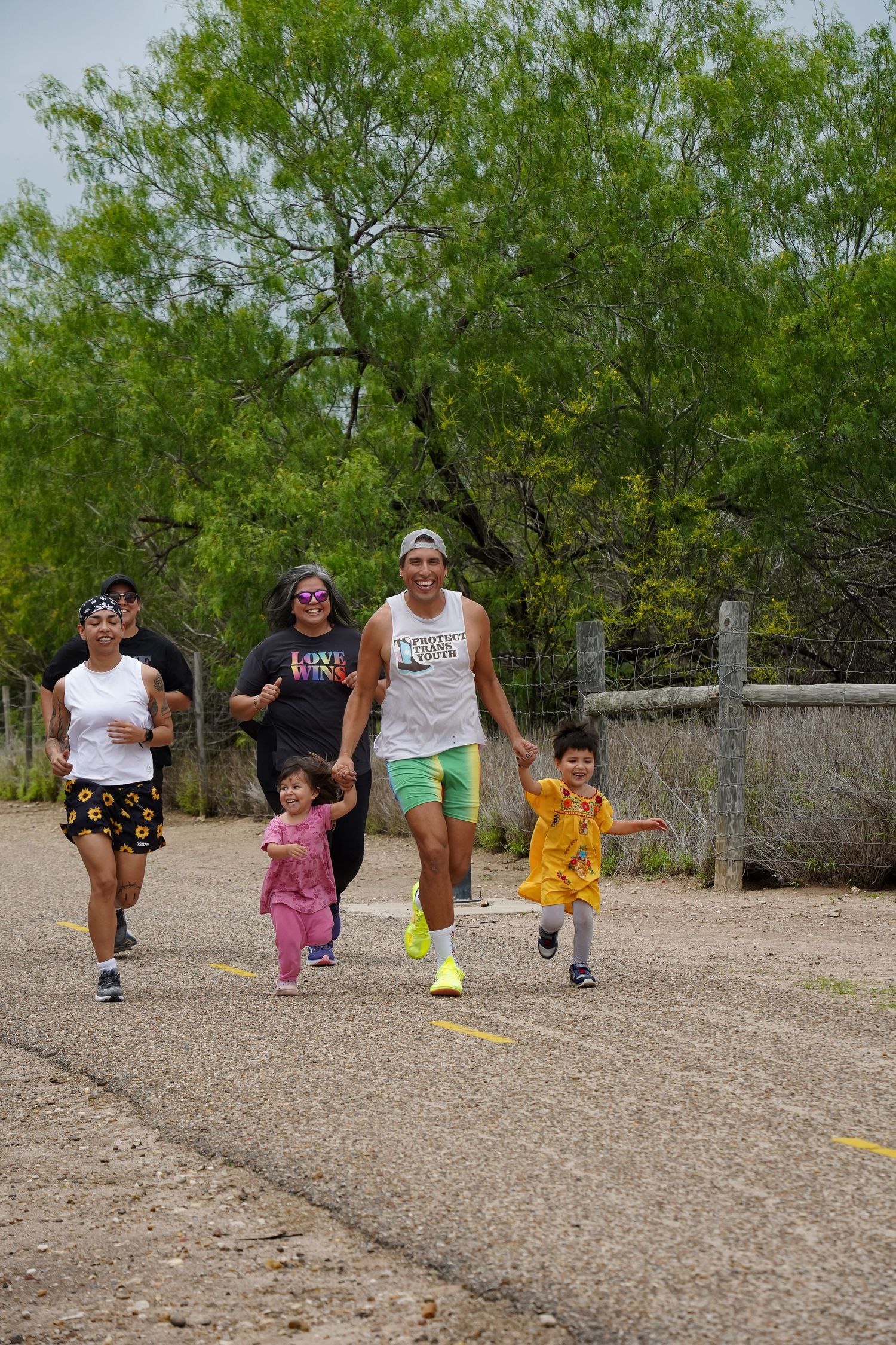
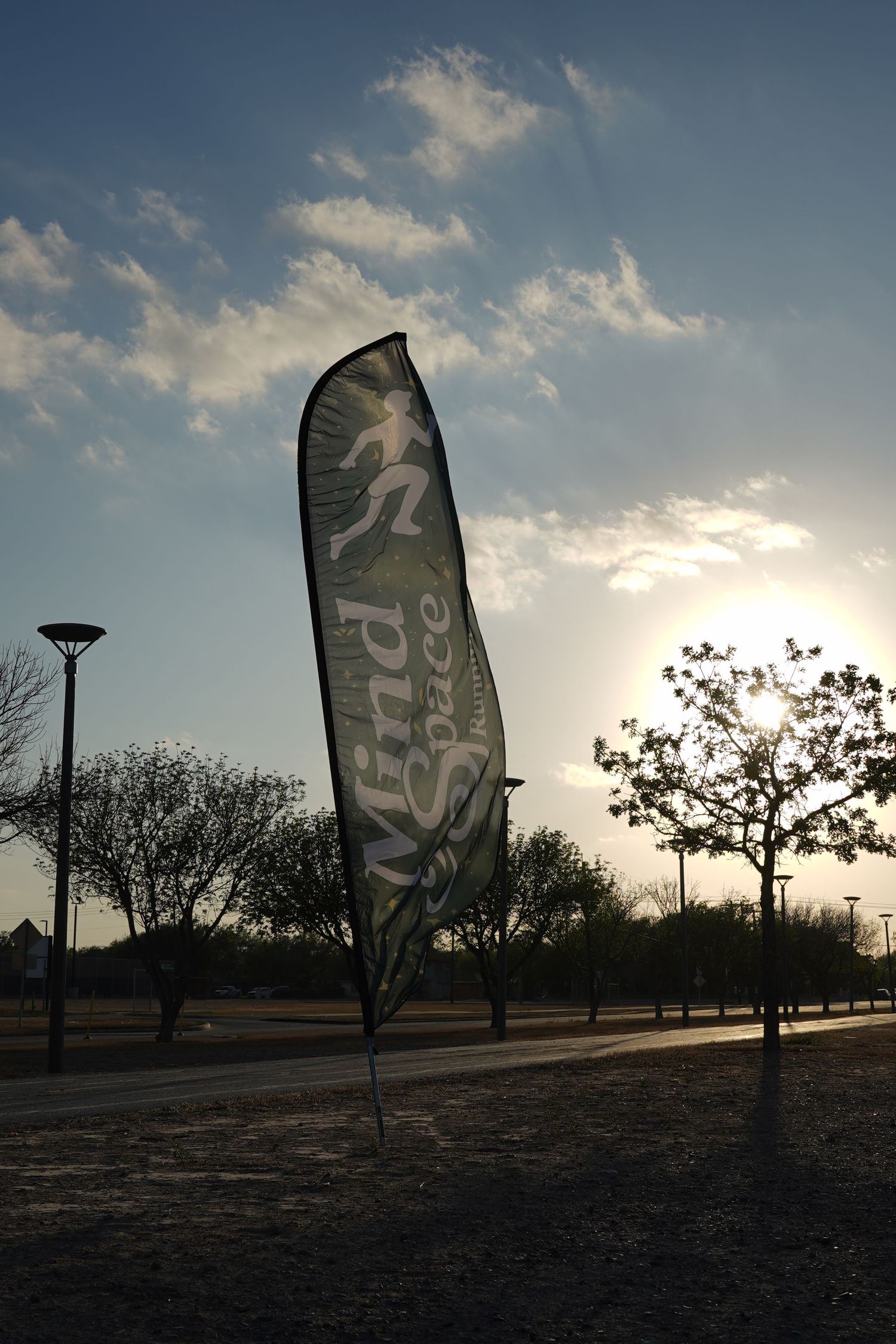
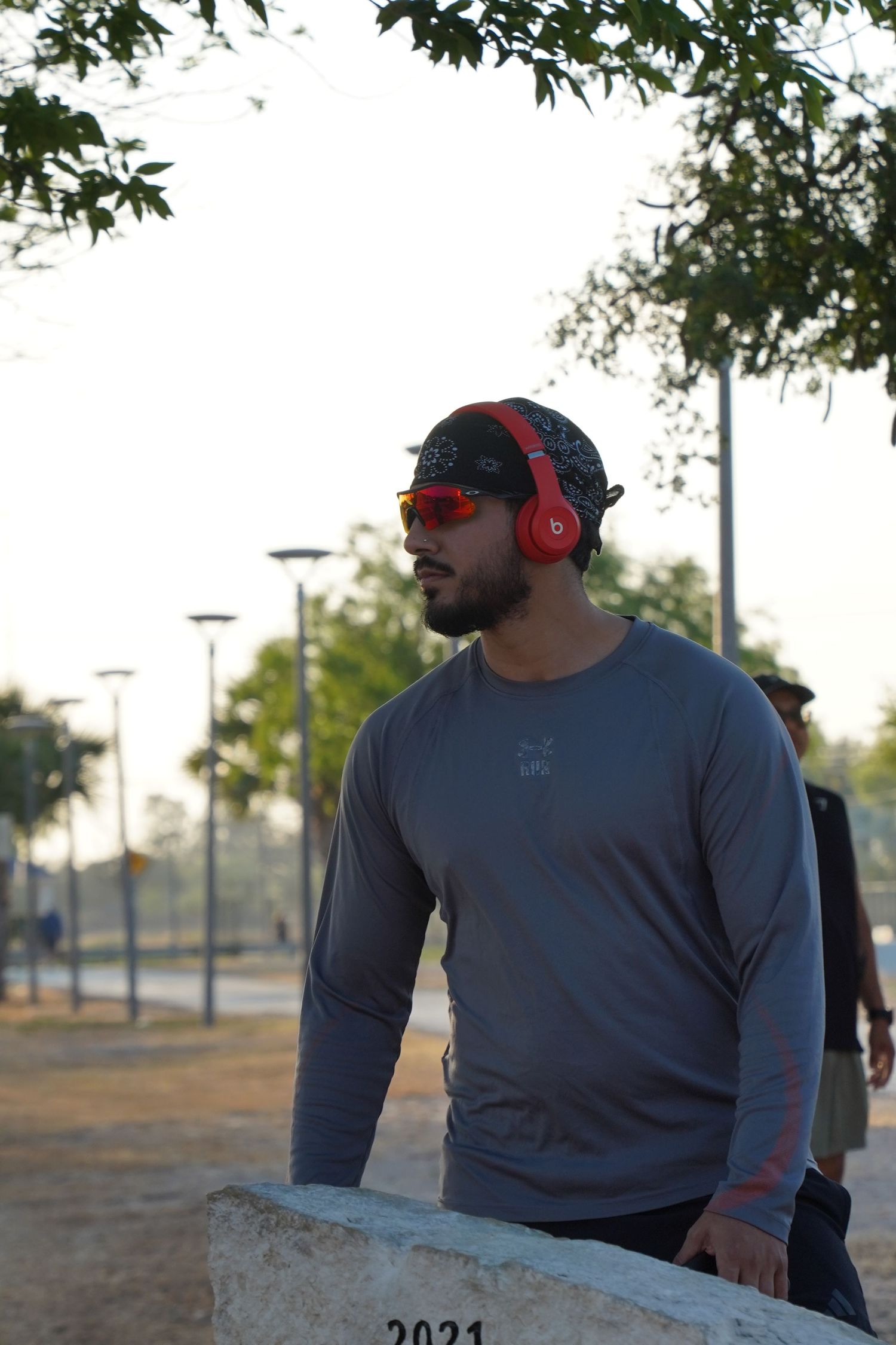
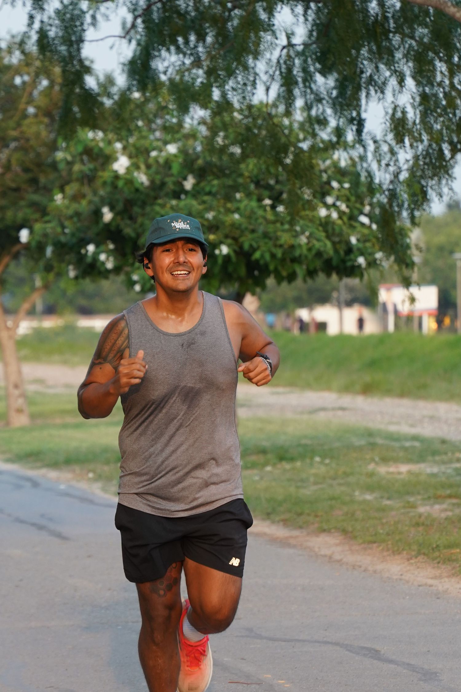
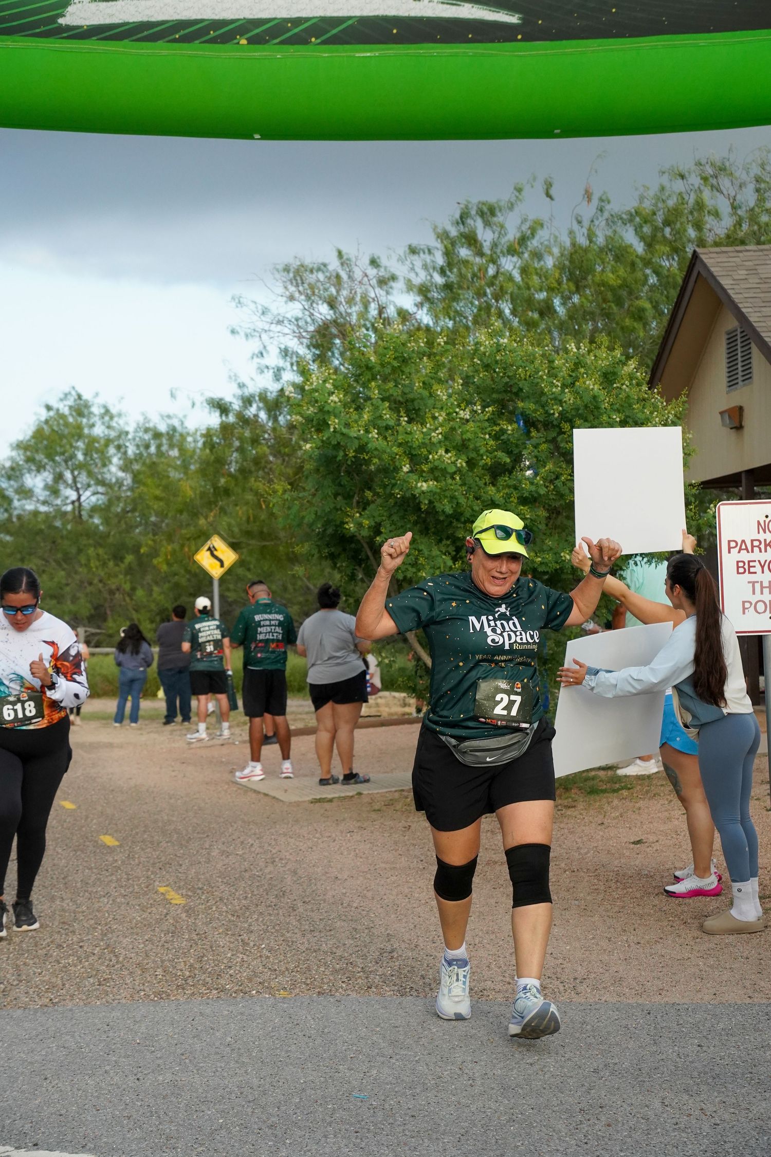
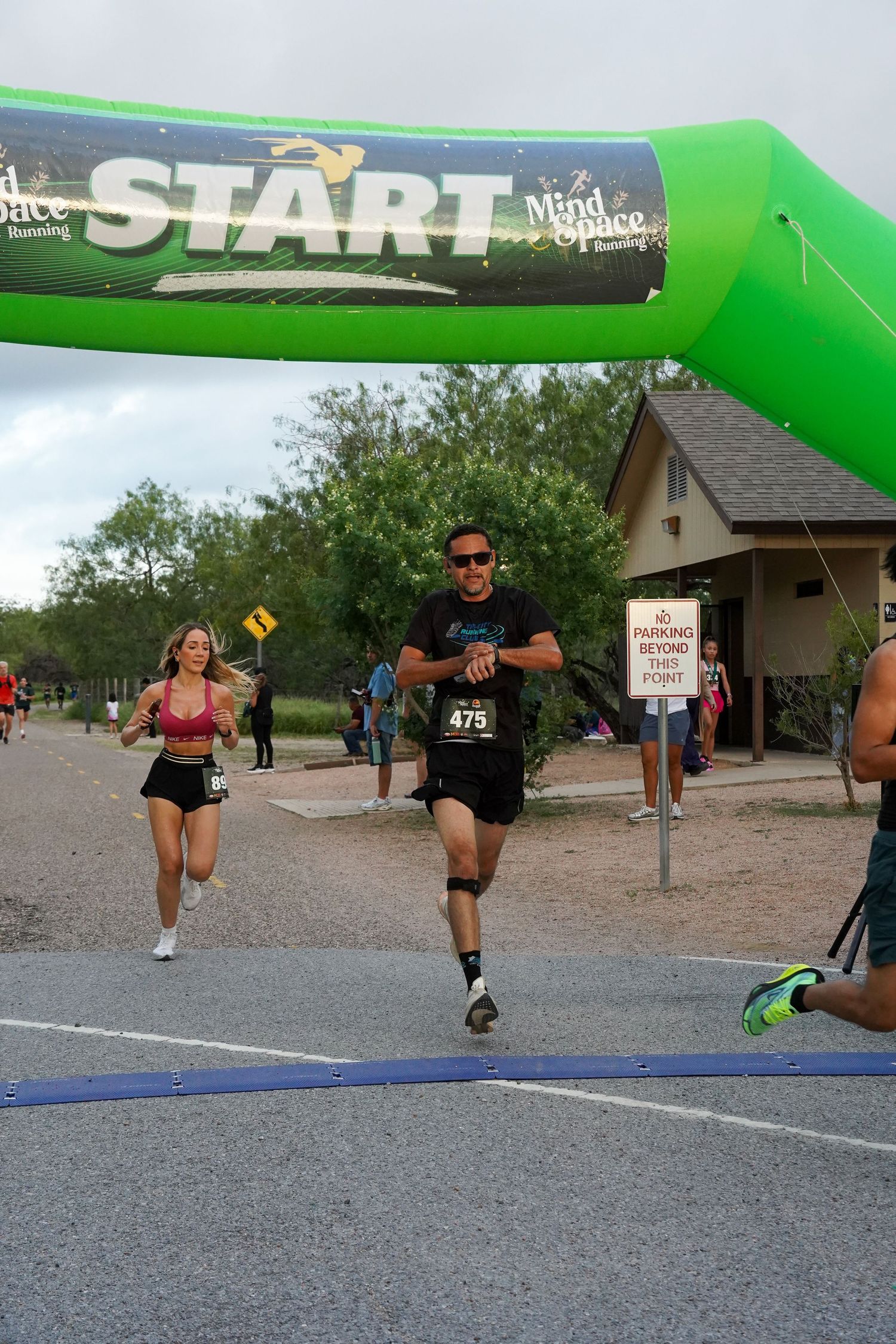
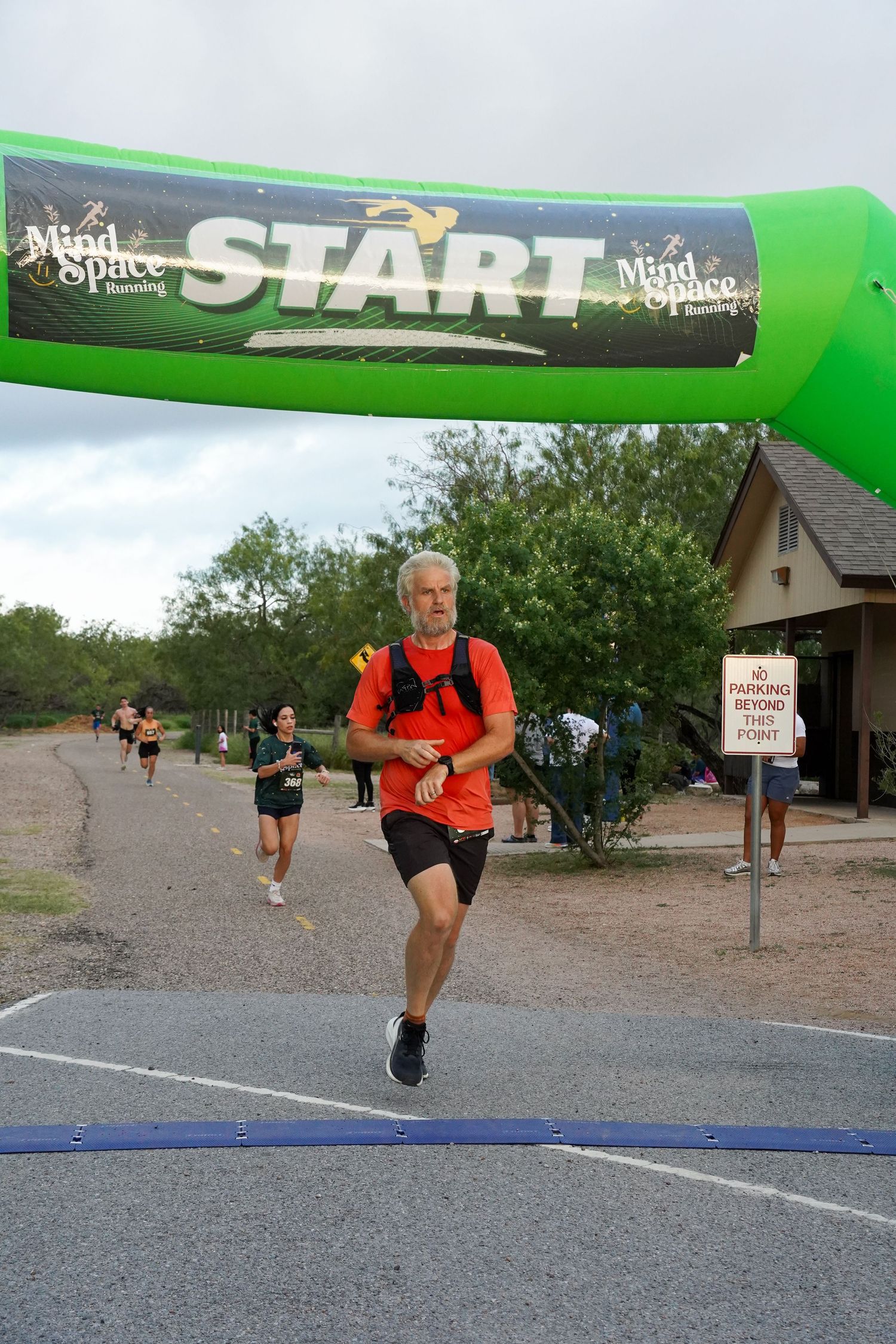
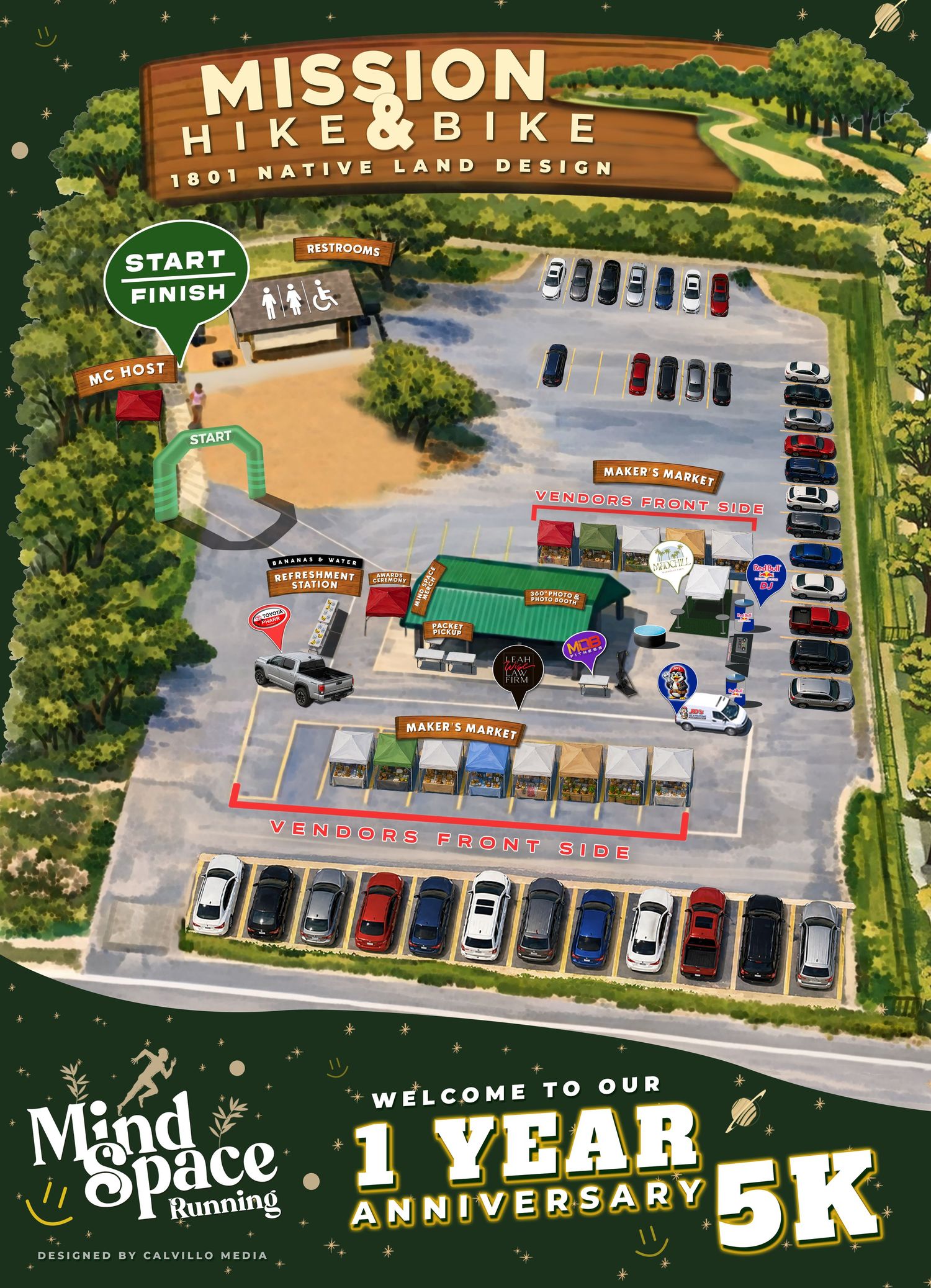
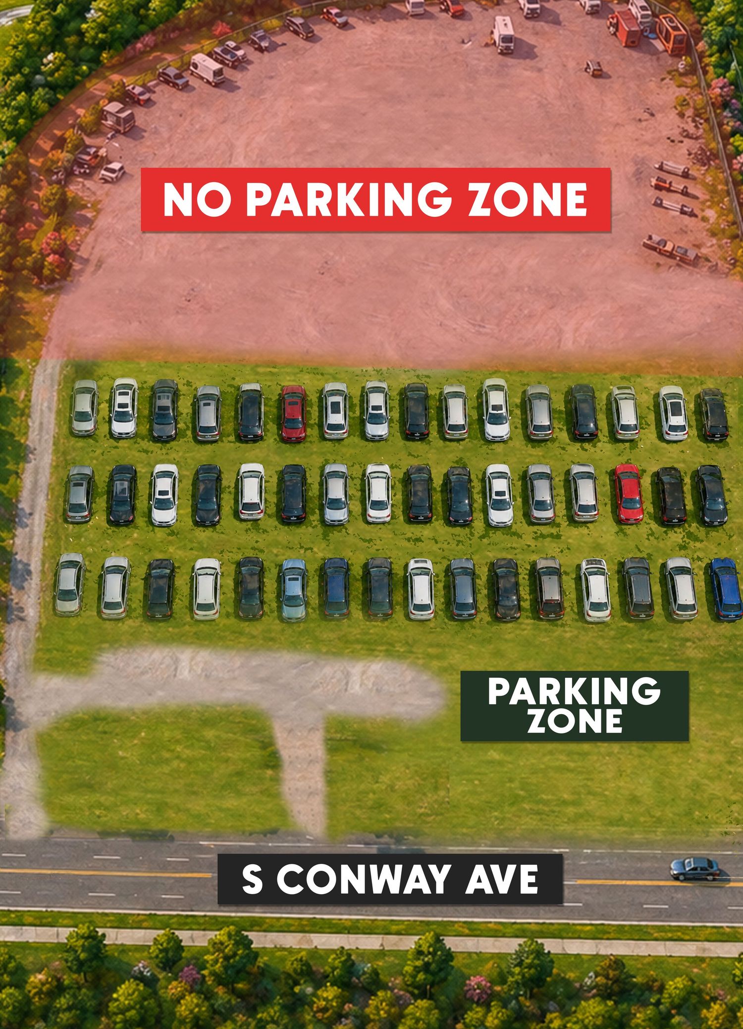
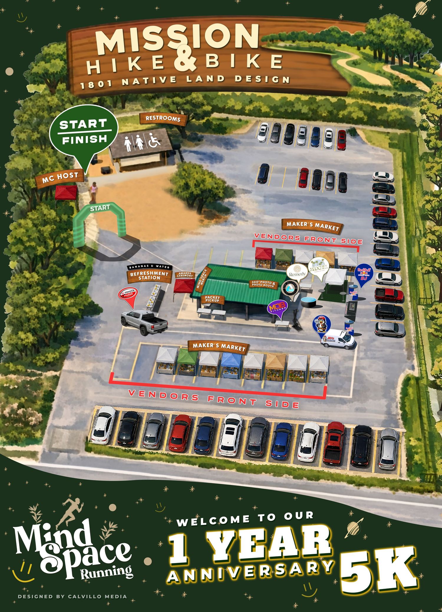
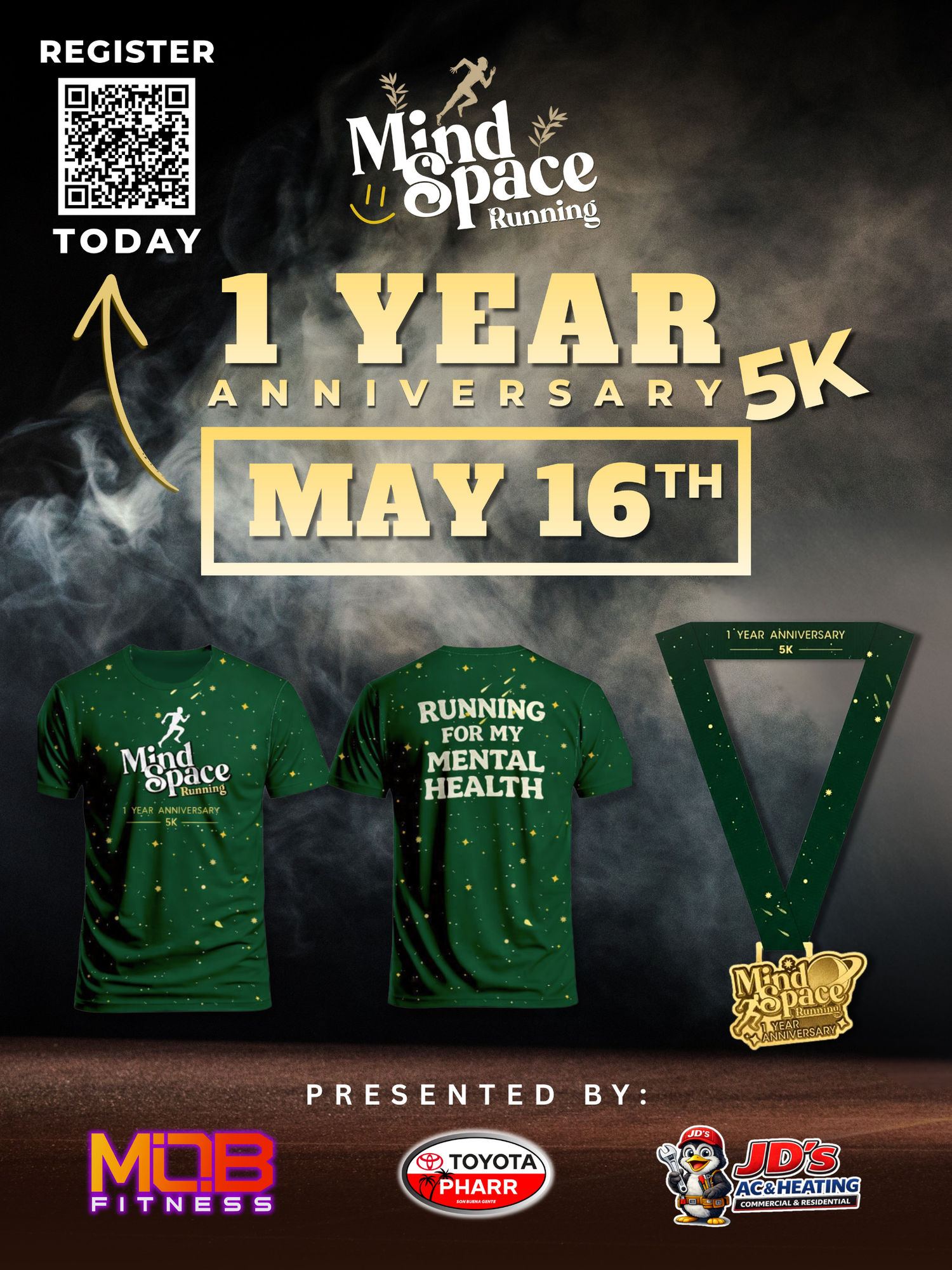
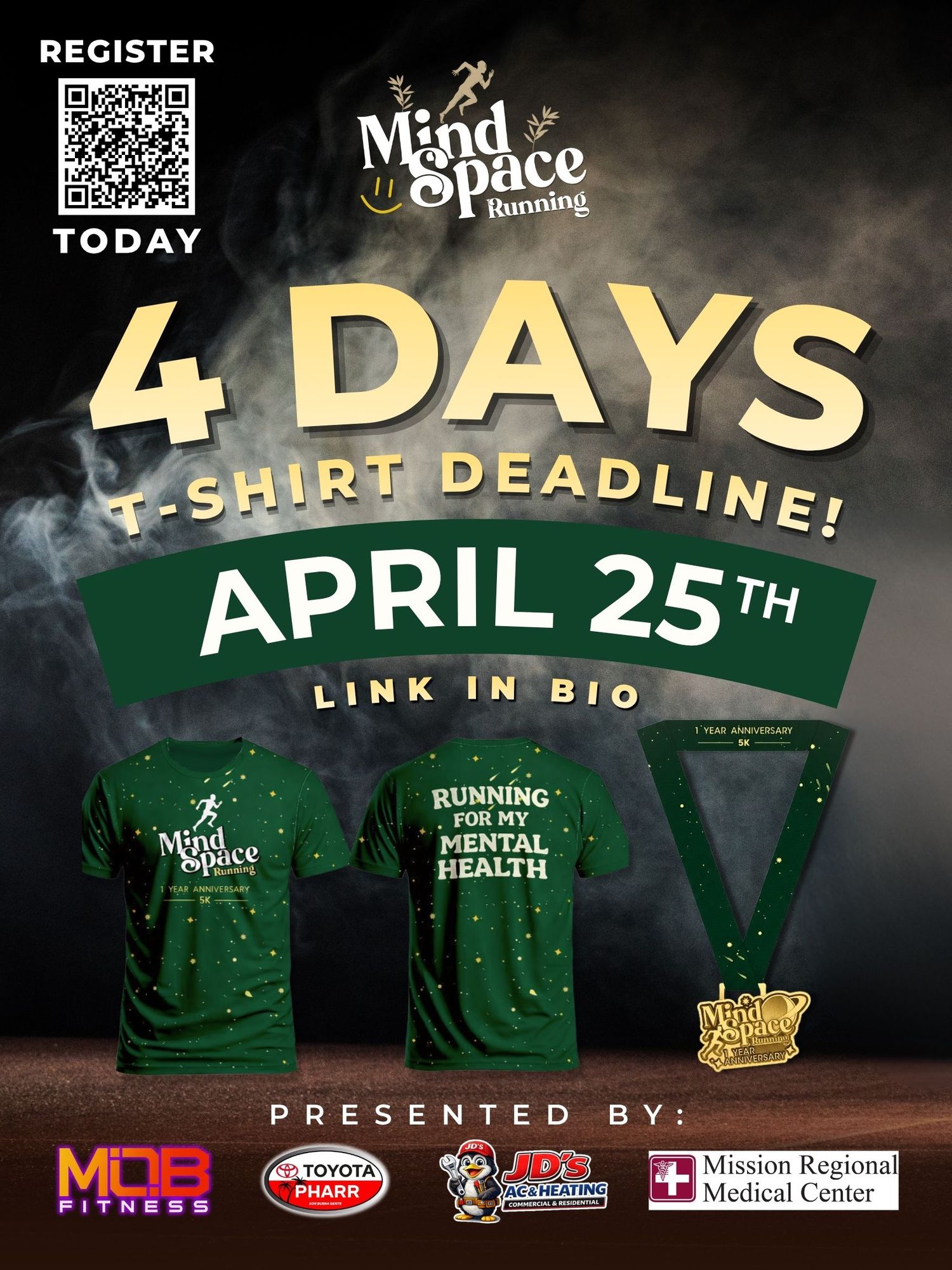
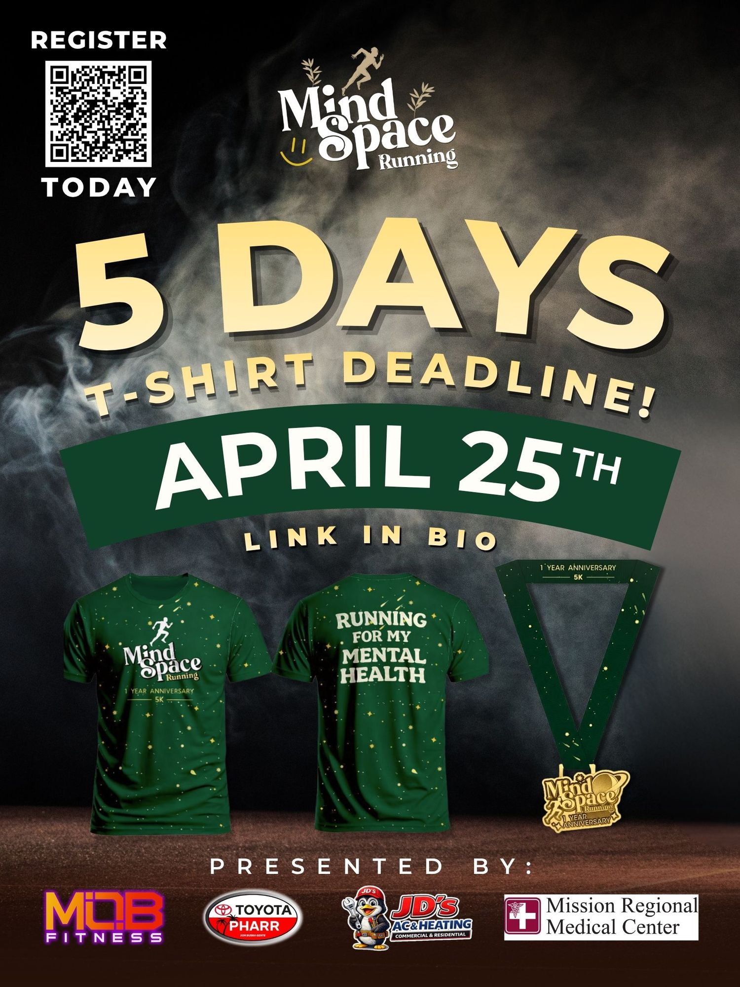
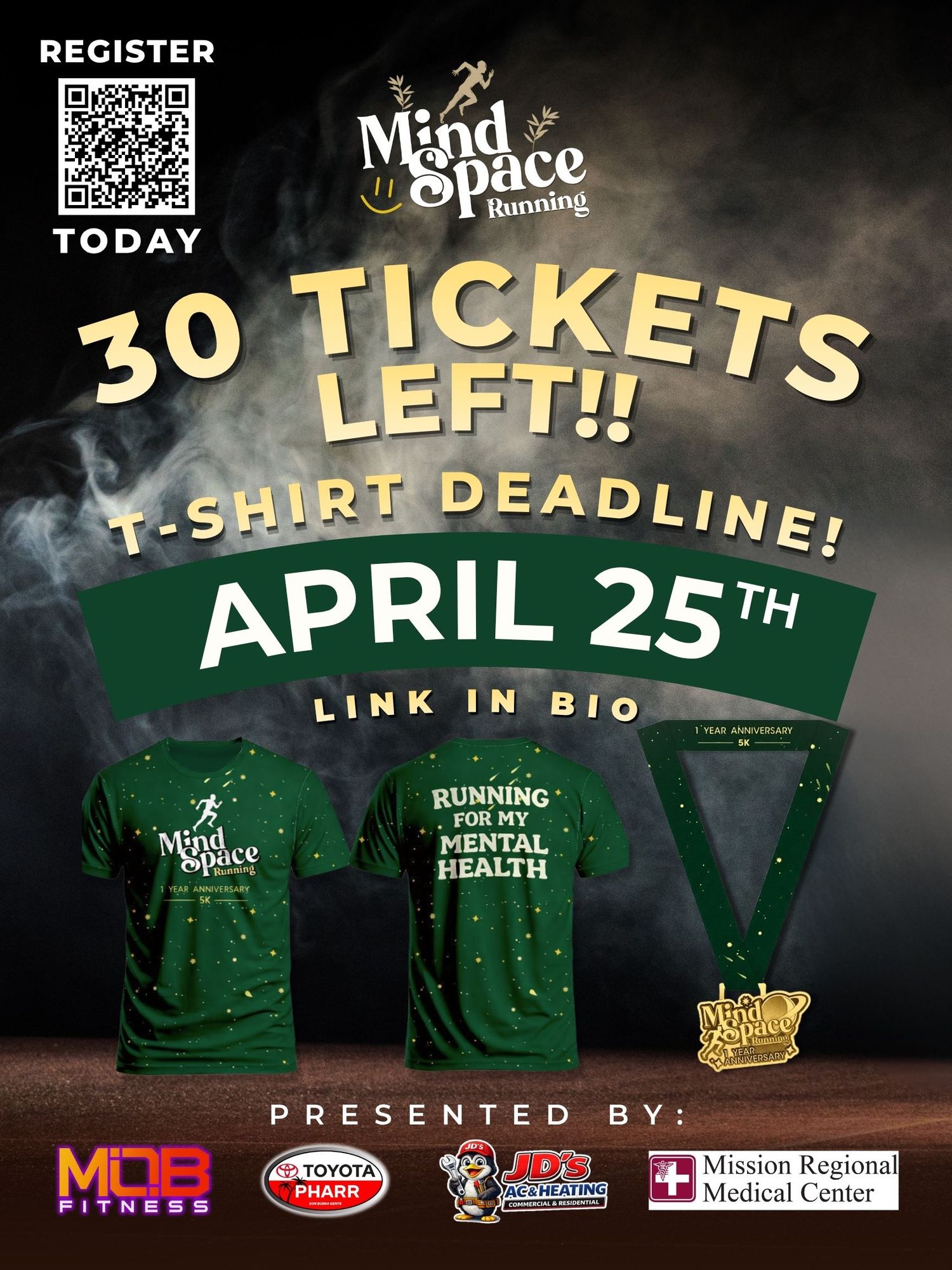
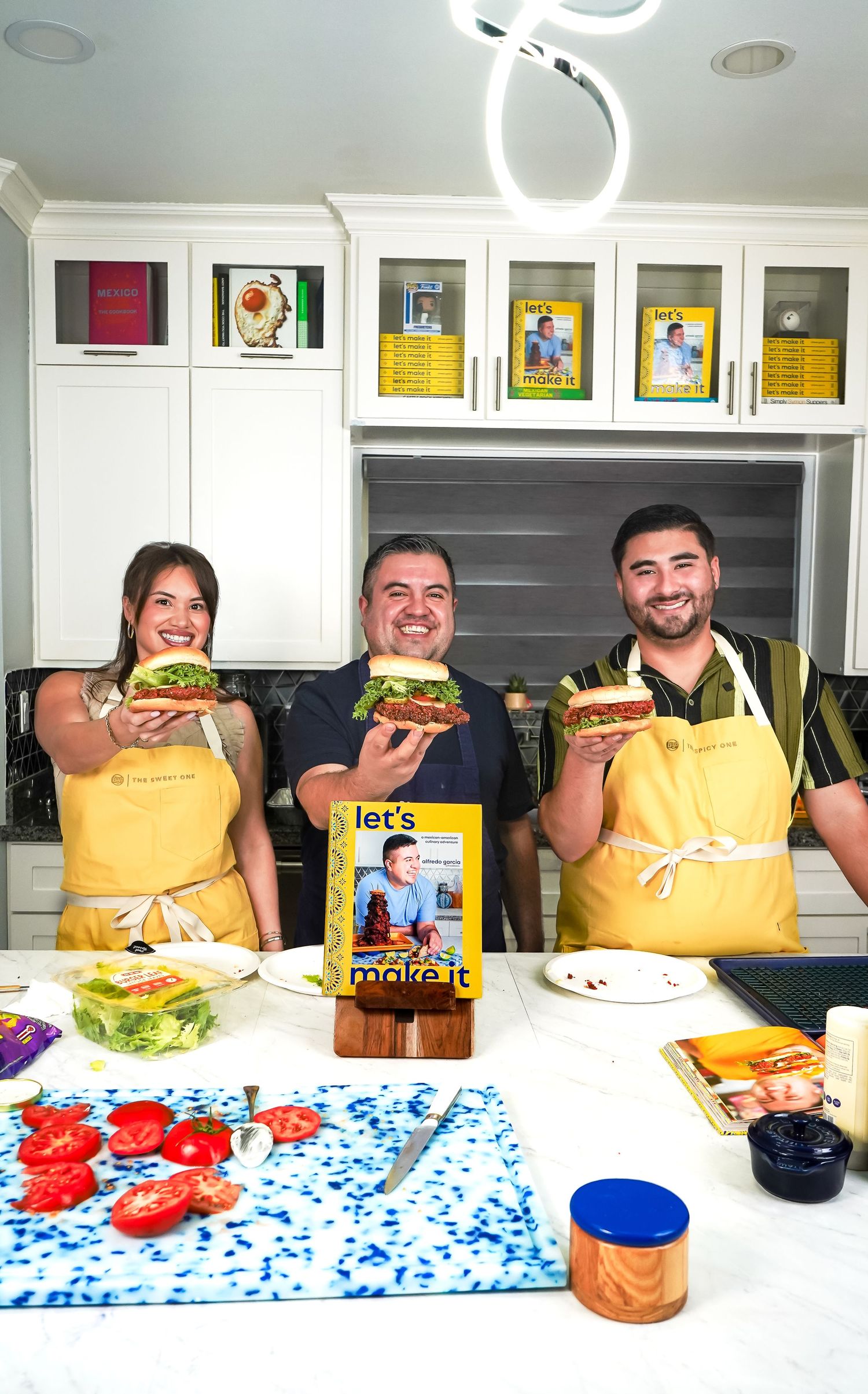
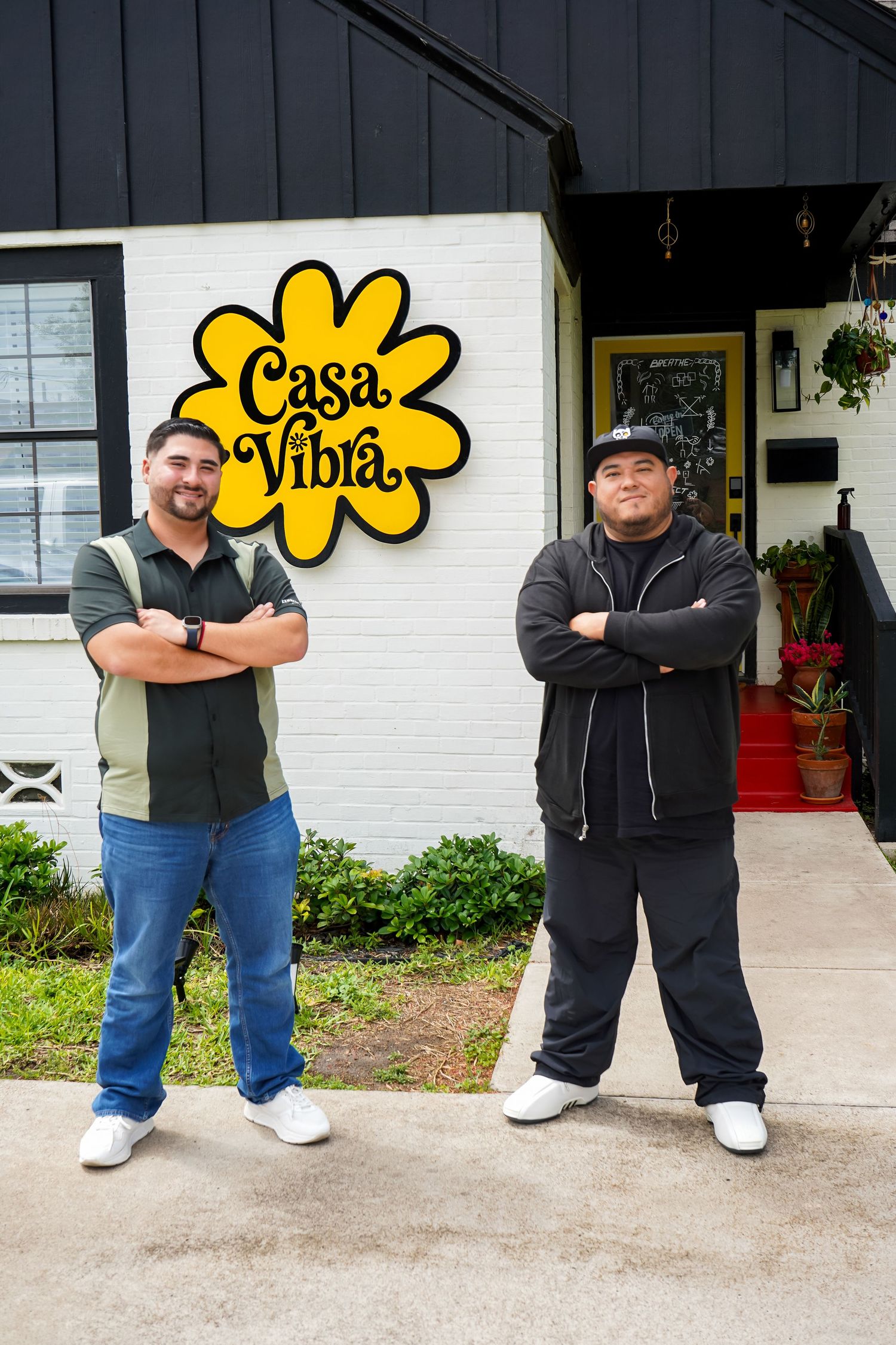
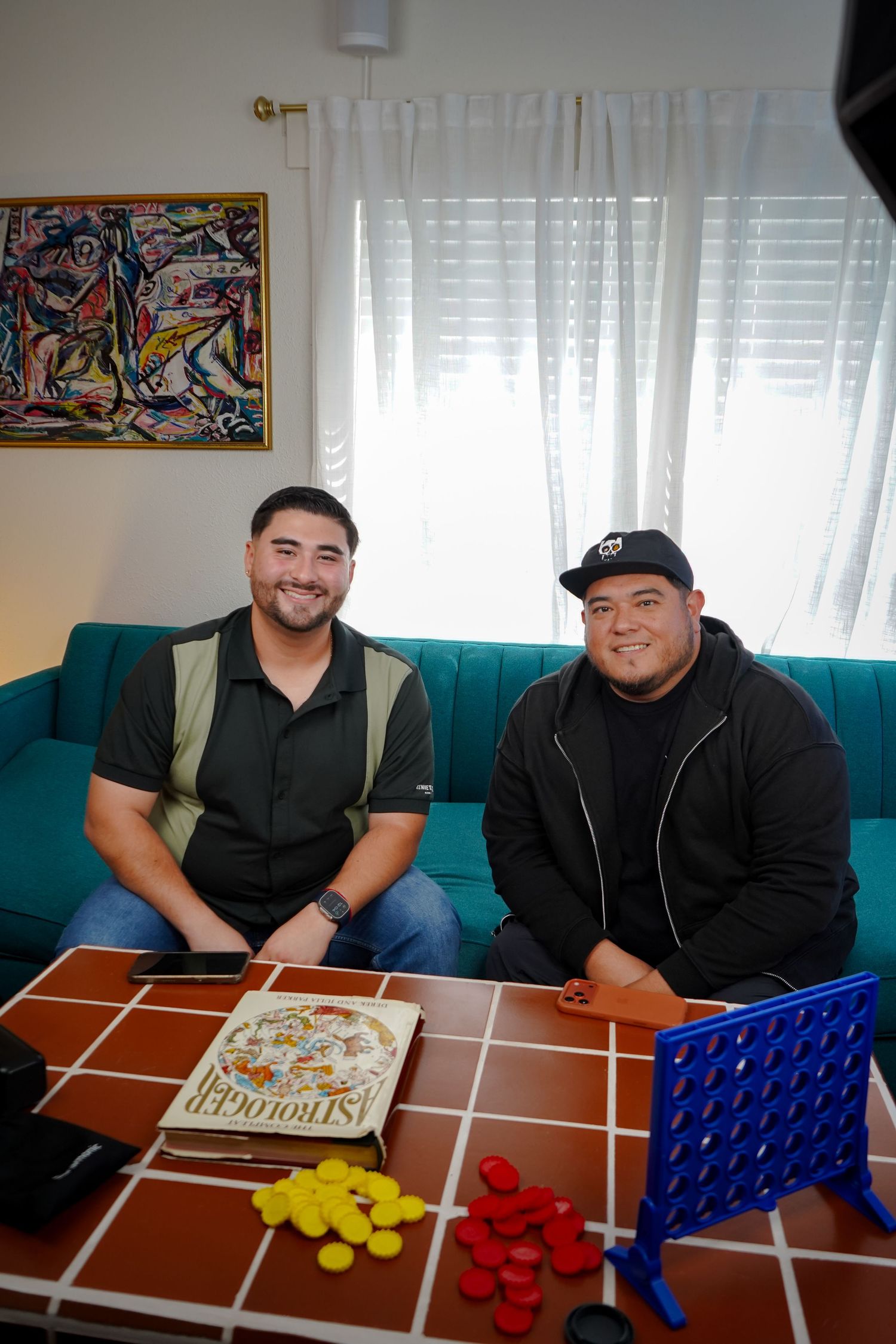
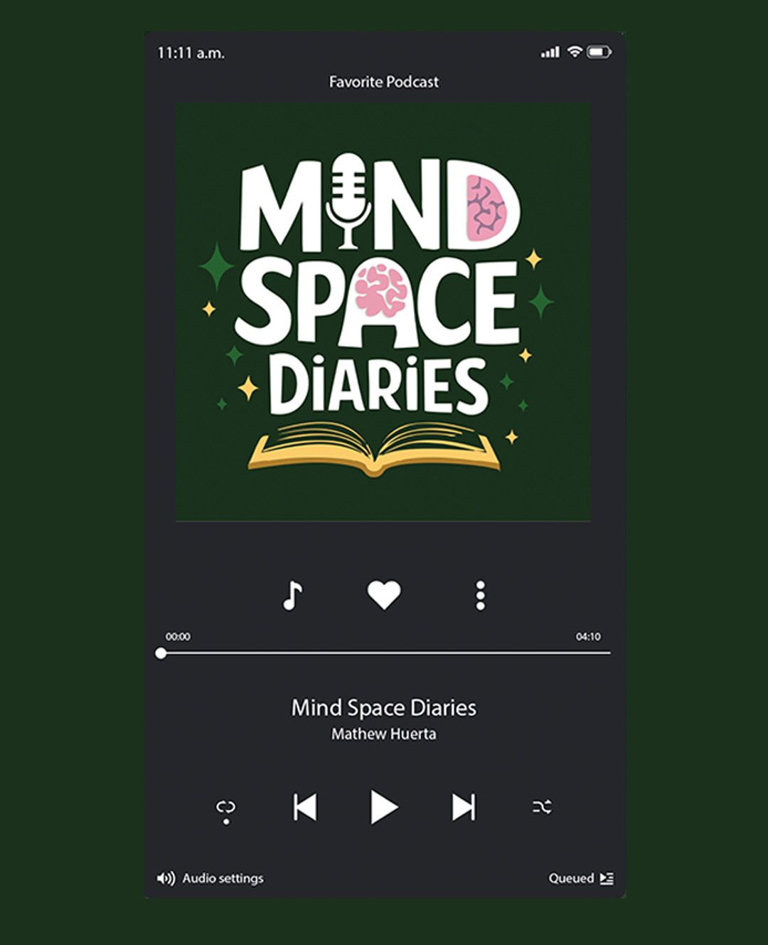
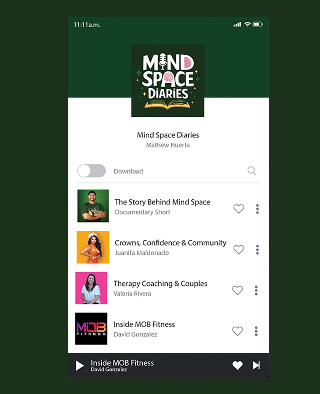
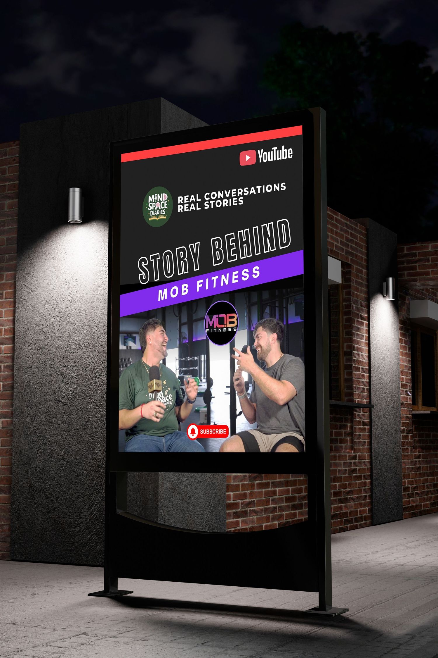
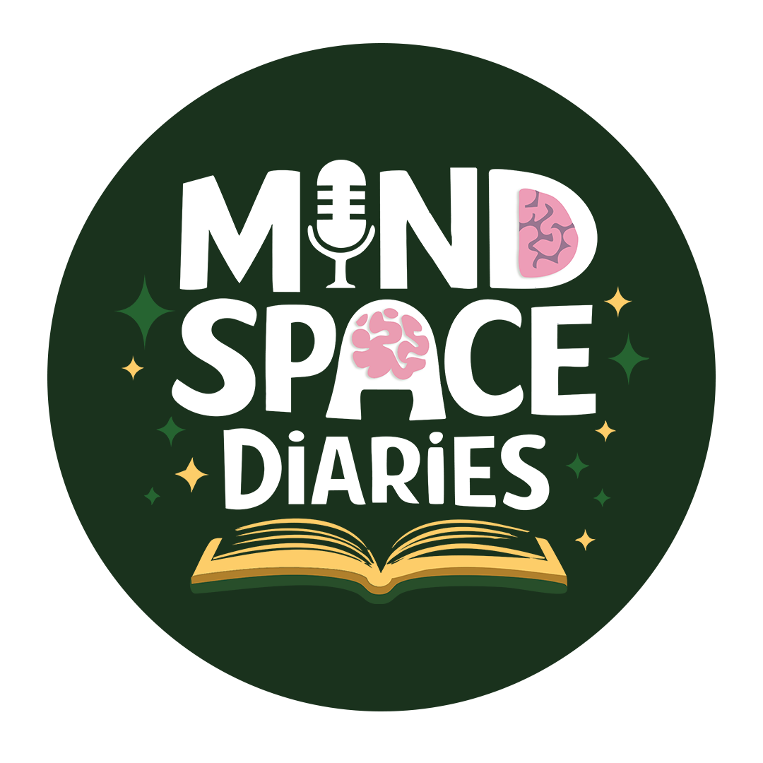
Mind Space Diaries is a YouTube-based podcast focused on promoting mental health awareness through open conversations and personal stories. I developed the logo and branding as an extension of Mind Space LLC, while also supporting the podcast’s creative direction, filming setup, production, promotional content and post production editing.
MIND SPACE DIARIES
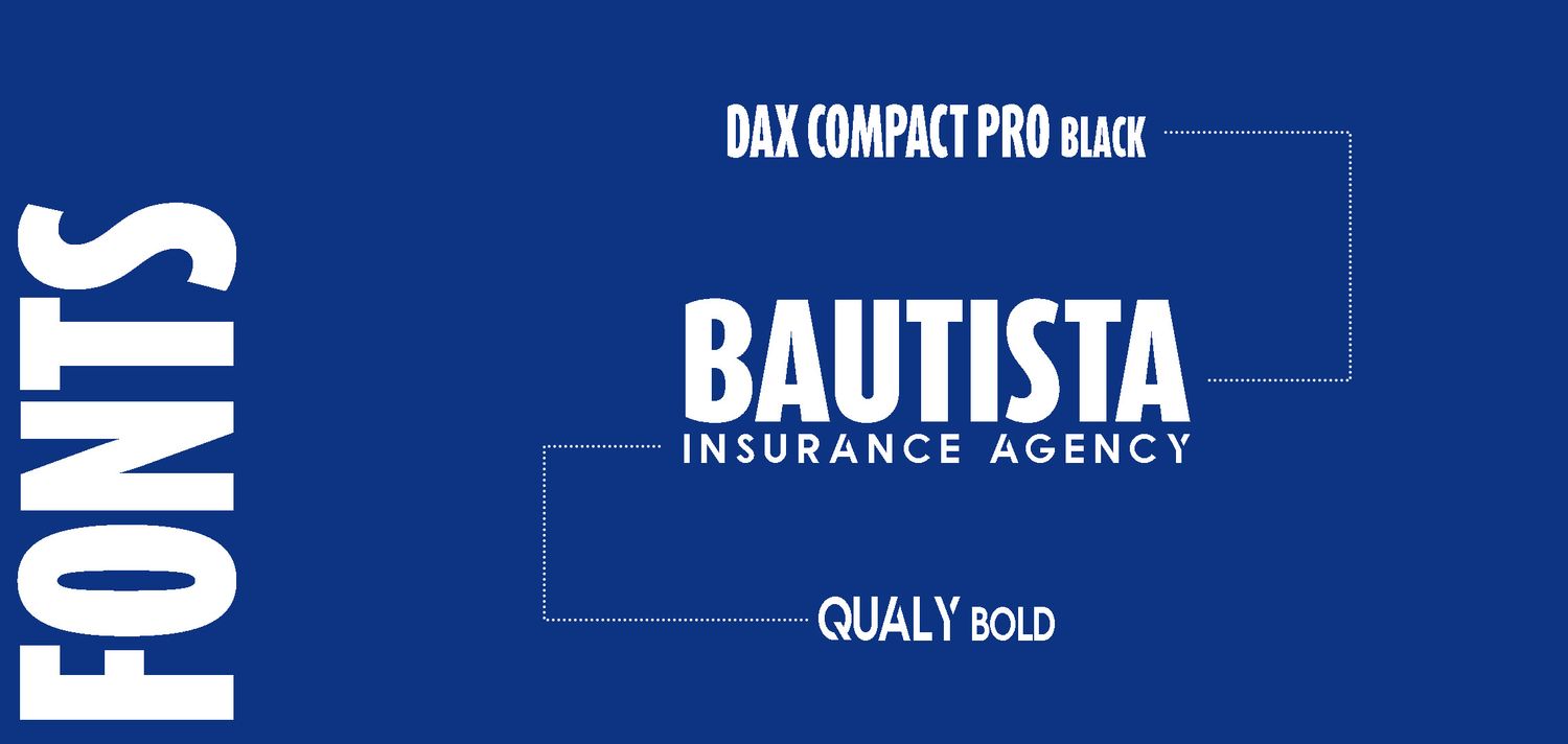

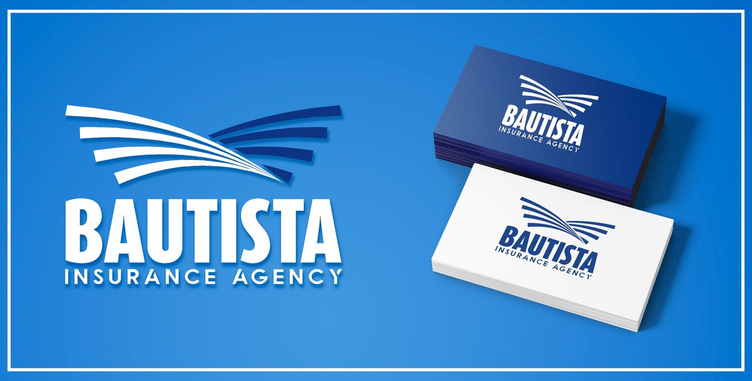

bautista insurance agency providing insurance services with a focus on trust, protection and professionalism.I incorporated a wing inspired mark with a clean blue and white palette to create a strong, recognizable identity that still feels approachable and dependable.
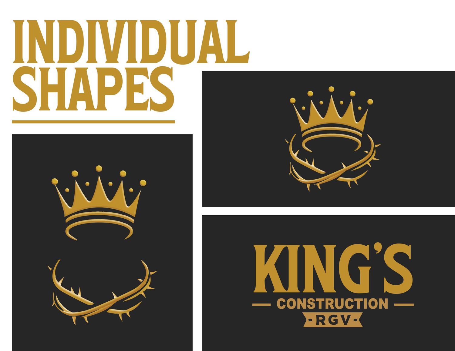
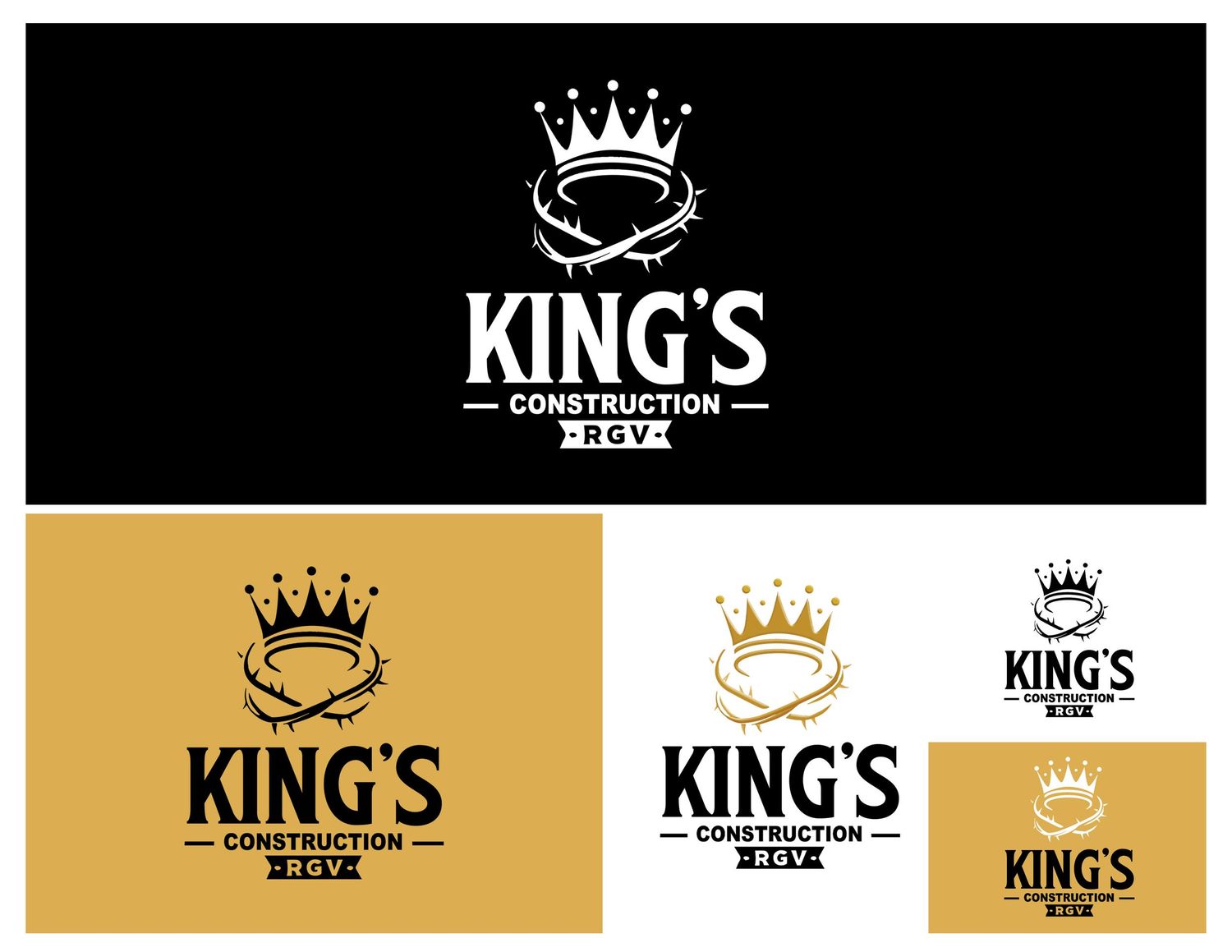
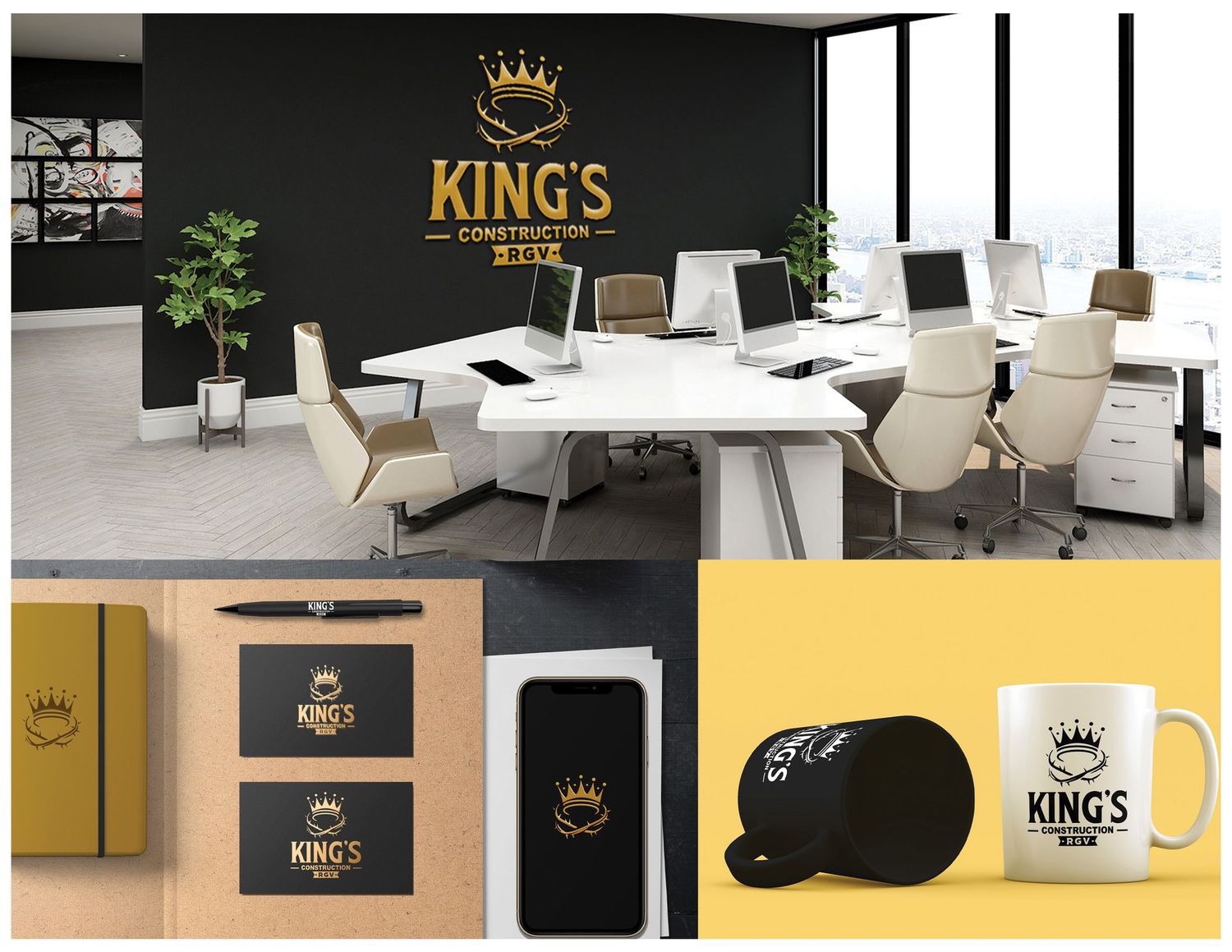
King’s Construction RGV is a local construction company focused on strong, dependable work. For their identity, I used a bold crown-inspired mark with black and gold tones to give the brand a confident, established and professional look that fits the construction industry.
the client wanted to symbolize the crown of jesus christ and
a king's crown plus bold texts and a plaque like "rgv".
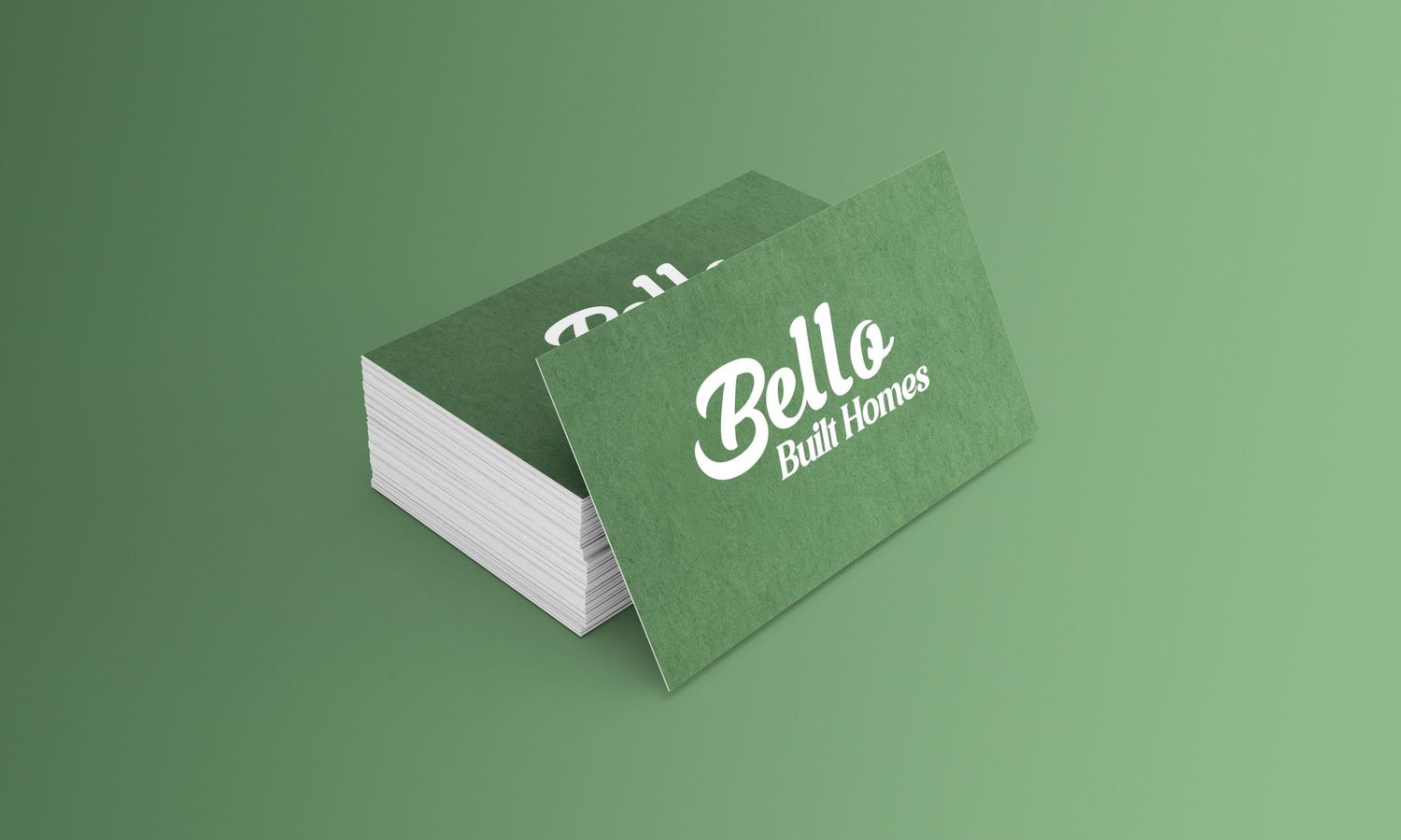
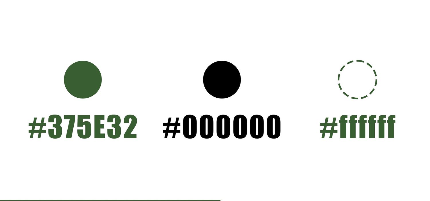
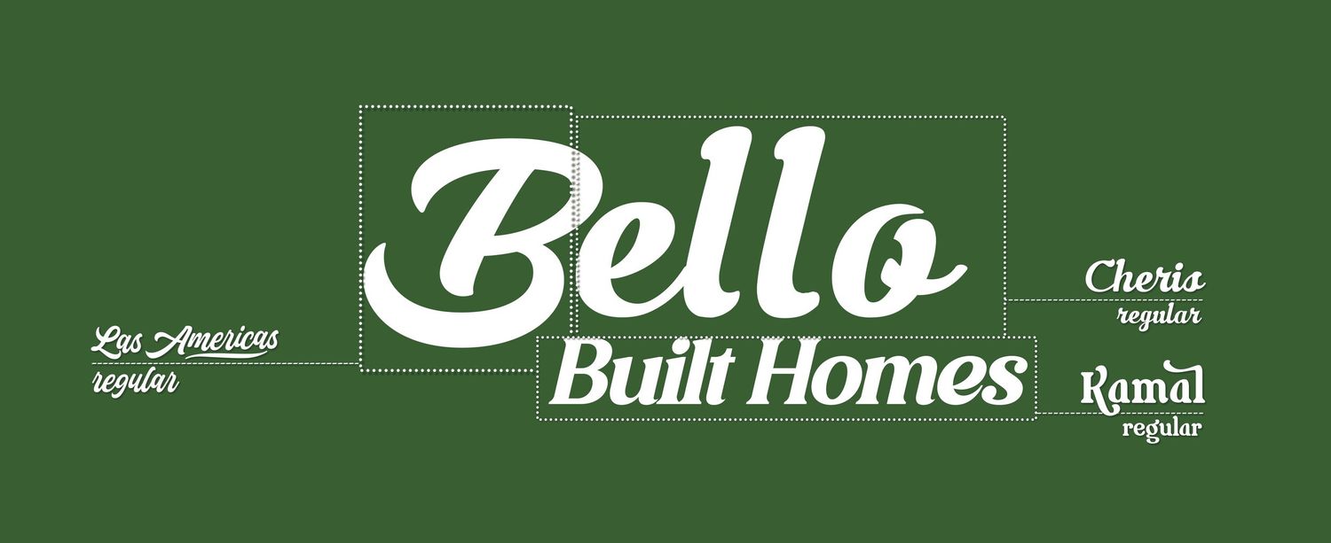
Bello Built Homes focuses on creating welcoming, thoughtfully designed homes. For their logo, they wanted “Bello” in a soft cursive style with a subtle green tone to give the brand a natural, approachable and professional feel.

BAUTISTA INSUrANCE AGENCY
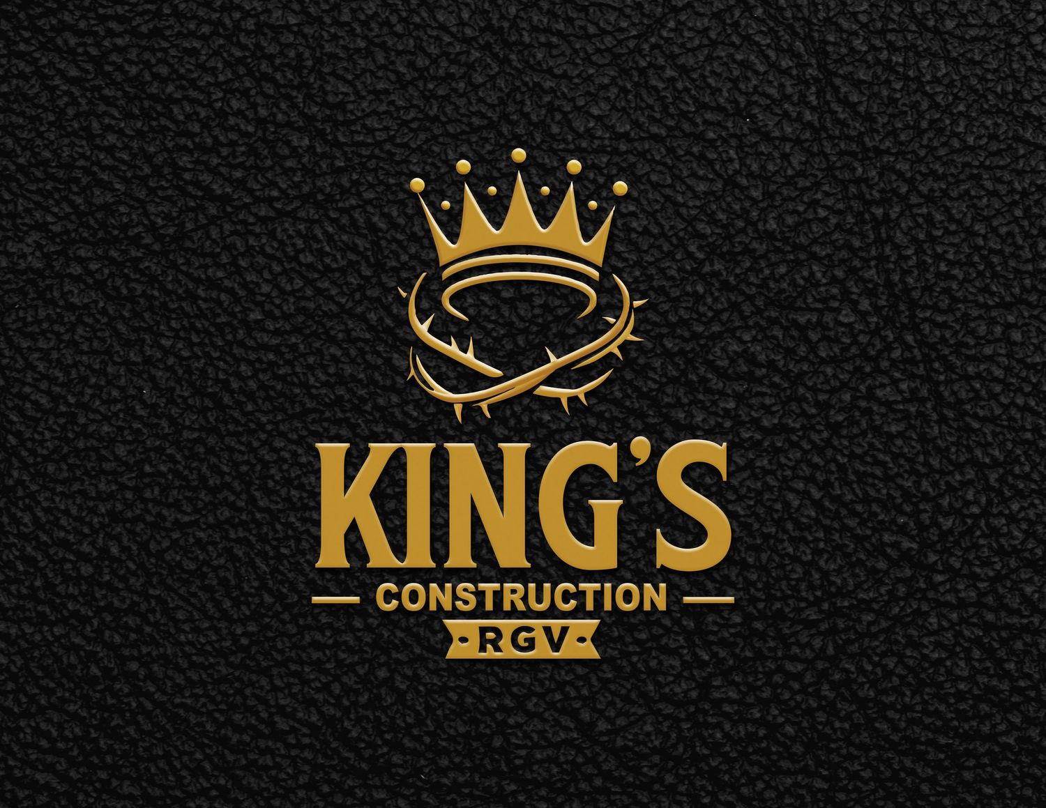
king's construction rgv
BELLO BUilT HOMES

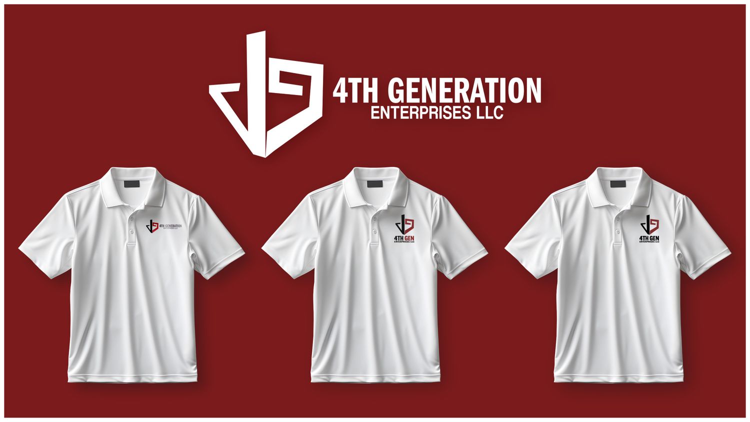
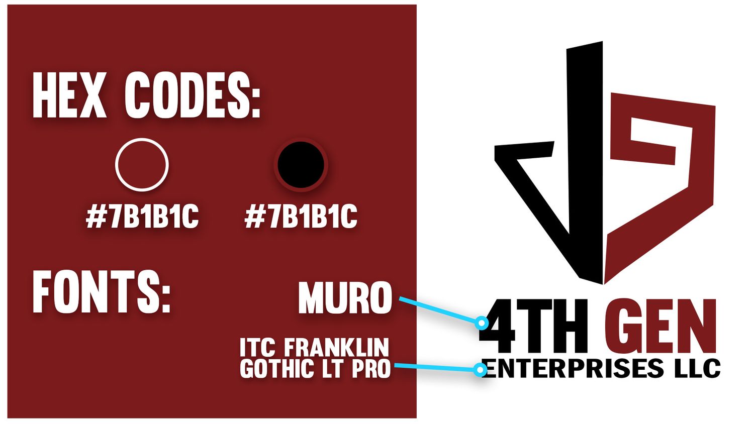
4TH GENERATION ENTERPRISES
4th Gen Enterprises LLC is a construction company focused on residential and commercial projects. I created the company’s logo and visual branding while also helping develop marketing content, photography, video, and social media visuals to give the brand a strong and professional presence.